this post was submitted on 09 Nov 2023
166 points (92.3% liked)
Political Memes
6045 readers
2562 users here now
Welcome to politcal memes!
These are our rules:
Be civil
Jokes are okay, but don’t intentionally harass or disturb any member of our community. Sexism, racism and bigotry are not allowed. Good faith argumentation only. No posts discouraging people to vote or shaming people for voting.
No misinformation
Don’t post any intentional misinformation. When asked by mods, provide sources for any claims you make.
Posts should be memes
Random pictures do not qualify as memes. Relevance to politics is required.
No bots, spam or self-promotion
Follow instance rules, ask for your bot to be allowed on this community.
founded 2 years ago
MODERATORS
you are viewing a single comment's thread
view the rest of the comments
view the rest of the comments

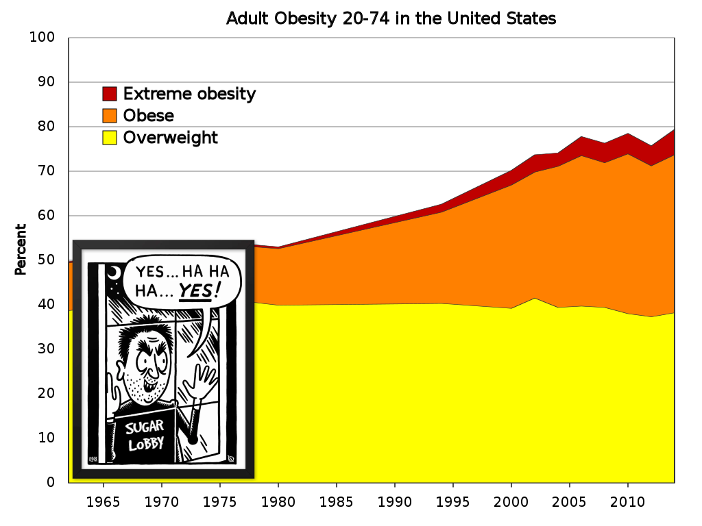
So, just to be clear, if I'm following correctly: the chart is incorrect. The error in the chart is that it ignores that obese people are also overweight, and "extreme obese" people are also both obese and overweight.
So rather than show the obese people as a subset of overweight, and extreme obese as a subset of obese, the chart is adding the percentages together to falsely represent each designation cumulatively.