this post was submitted on 30 Oct 2023
794 points (95.2% liked)
linuxmemes
22403 readers
2260 users here now
Hint: :q!
Sister communities:
Community rules (click to expand)
1. Follow the site-wide rules
- Instance-wide TOS: https://legal.lemmy.world/tos/
- Lemmy code of conduct: https://join-lemmy.org/docs/code_of_conduct.html
2. Be civil
- Understand the difference between a joke and an insult.
- Do not harrass or attack users for any reason. This includes using blanket terms, like "every user of thing".
- Don't get baited into back-and-forth insults. We are not animals.
- Leave remarks of "peasantry" to the PCMR community. If you dislike an OS/service/application, attack the thing you dislike, not the individuals who use it. Some people may not have a choice.
- Bigotry will not be tolerated.
- These rules are somewhat loosened when the subject is a public figure. Still, do not attack their person or incite harrassment.
3. Post Linux-related content
- Including Unix and BSD.
- Non-Linux content is acceptable as long as it makes a reference to Linux. For example, the poorly made mockery of
sudoin Windows. - No porn. Even if you watch it on a Linux machine.
4. No recent reposts
- Everybody uses Arch btw, can't quit Vim, <loves/tolerates/hates> systemd, and wants to interject for a moment. You can stop now.
5. 🇬🇧 Language/язык/Sprache
- This is primarily an English-speaking community. 🇬🇧🇦🇺🇺🇸
- Comments written in other languages are allowed.
- The substance of a post should be comprehensible for people who only speak English.
- Titles and post bodies written in other languages will be allowed, but only as long as the above rule is observed.
Please report posts and comments that break these rules!
Important: never execute code or follow advice that you don't understand or can't verify, especially here. The word of the day is credibility. This is a meme community -- even the most helpful comments might just be shitposts that can damage your system. Be aware, be smart, don't remove France.
founded 2 years ago
MODERATORS
you are viewing a single comment's thread
view the rest of the comments
view the rest of the comments

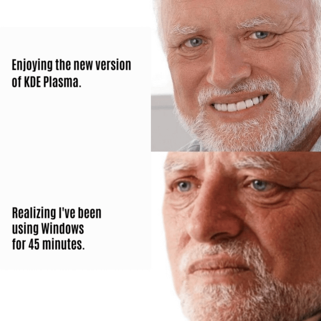
The UI of Windows 11 is fine, at least visually. Windows 8-10 were mostly just ugly. When it comes to configuration options, they lose even against Plasma from a couple years ago.
I have a Mac like UI btw., there is no chance of confusing my Plasma with any Windows :P
It just so happens that I also use Arch x)
UI is fine... UX is a few good steps backward
I feel like the windows 11 ui looks really nice and it seems like they could do a lot with it, but at least last time I actually tried it it just felt kind of unfinished and there were a lot of weird bits where the theming looked wrong