this post was submitted on 07 Oct 2023
260 points (98.1% liked)
Climate - truthful information about climate, related activism and politics.
5589 readers
600 users here now
Discussion of climate, how it is changing, activism around that, the politics, and the energy systems change we need in order to stabilize things.
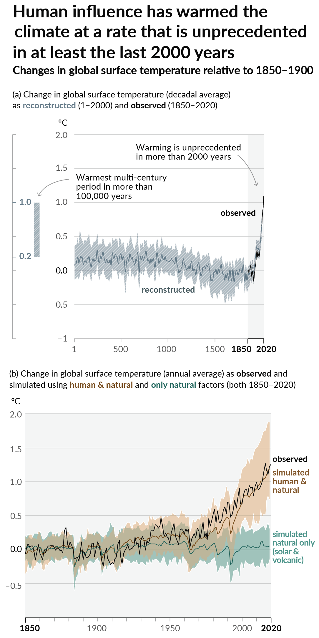
As a starting point, the burning of fossil fuels, and to a lesser extent deforestation and release of methane are responsible for the warming in recent decades:

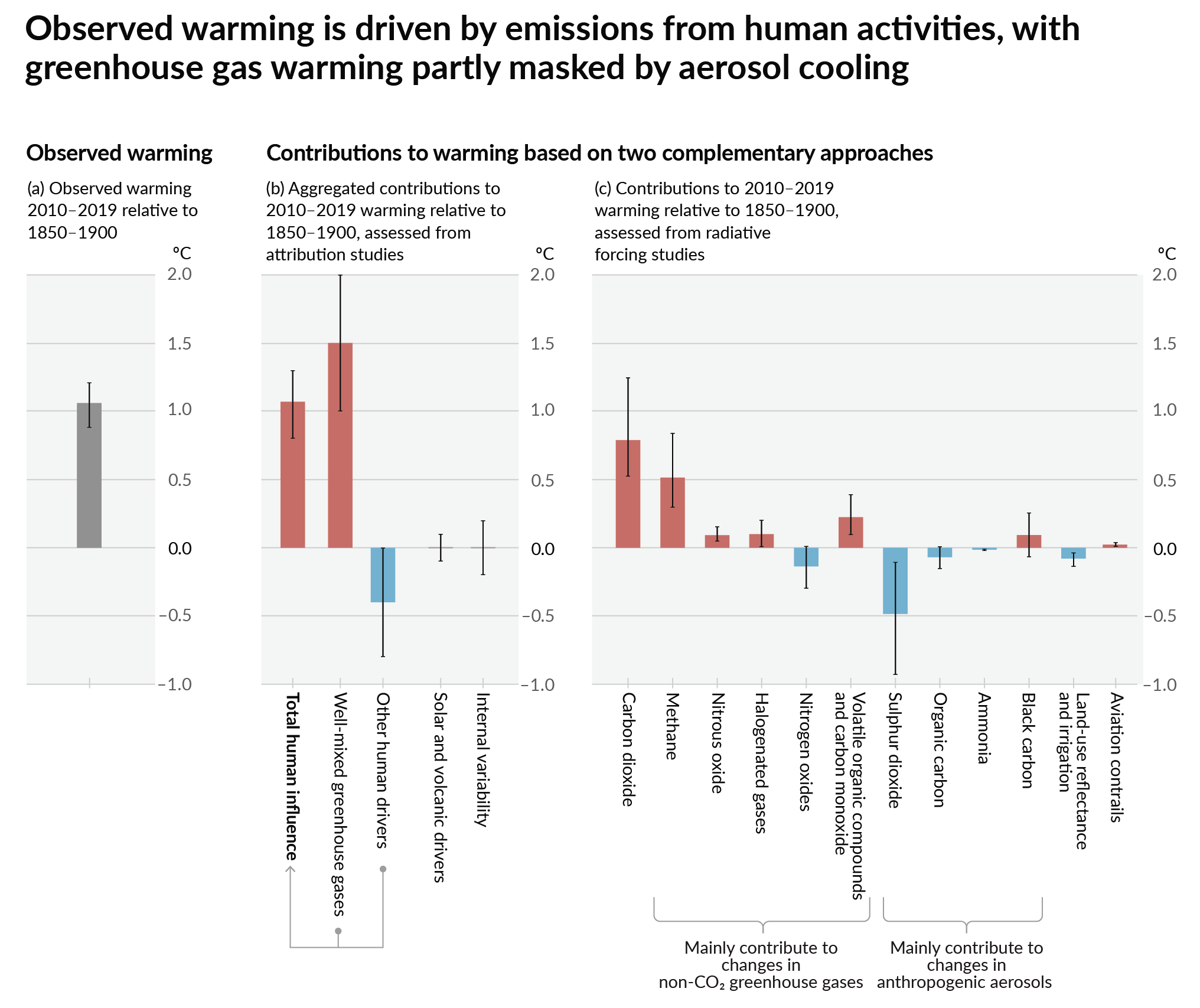
How much each change to the atmosphere has warmed the world:

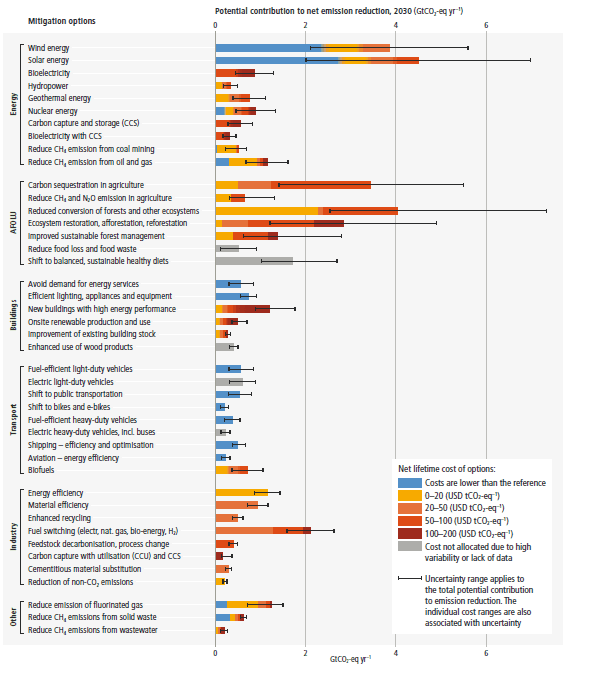
Recommended actions to cut greenhouse gas emissions in the near future:

Anti-science, inactivism, and unsupported conspiracy theories are not ok here.
founded 2 years ago
MODERATORS
you are viewing a single comment's thread
view the rest of the comments
view the rest of the comments
what's up with that graph? why not just have temperature on the Y axis and time on the X axis
edit: what about the scale too? how big is that shift?
It’s a histogram.
For those confused a histogram is meant to give you an idea of the "shape" of data. It does this by mapping frequency of data points. That said I'm not a scientist and I'm also not use to seeing them without any values like this
They're trying to show a change in probability distribution, not just a temperature change over time. I agree that scale and such would be helpful.