Terrible Estate Agent Photos
Terrible photos listed by estate agents/realtors that are so bad they’re funny.
Posting guidelines.
Posts in this community must be of property (inside or out) listed for sale which contains a terrible element. “Terrible” can refer to:
-
the photo itself (finger over the lens, too far away, people in the shot, bad Photoshop, etc.)
-
the property (weird layout, questionable plumbing, unsound structure, etc.)
-
the interior (carpeted bathrooms, awful taste interiors, weird mannequins/taxidermies/art, inflatable pools indoors, etc.)
-
the actual listing itself including unusual descriptions and unrealistic pricing. However, this isn’t a community to discuss the housing market in general. This is a comedic community - let’s keep it light.
-
Photos can be sourced from anywhere and be any age, but please check they haven’t already been posted.
-
Censor any names/contact details of private individuals.
-
Mark the post NSFW if it includes nudity or sensitive content
Rules.
This community follows the rules of the feddit.uk instance and the lemmy.org code of conduct. I’ve summarised them here:
- Be civil, remember the human.
- No insulting or harassing other members. That includes name-calling.
- Respect differences of opinion. Civil discussion/debate is fine, arguing is not. Criticise ideas, not people.
- Keep unrequested/unstructured critique to a minimum.
- Remember we have all chosen to be here voluntarily. Respect the spent time and effort people have spent creating posts in order to share something they find amusing with you.
- Swearing in general is fine, swearing to insult another commenter isn’t.
- No racism, sexism, homophobia, transphobia, xenophobia or any other type of bigotry.
- No incitement of violence or promotion of violent ideologies.
view the rest of the comments

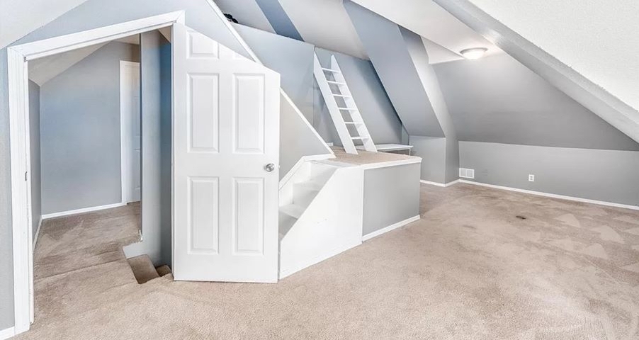
Y’all are harsh. This looks like someone optimized the architecture of the space as best as possible. The only thing that bothers me is the choice of door where it’s chopping the panels awkwardly.
Without being able to see the other side, the door swing direction bugs me too. Like why does it open to the middle of the room blocking the stairs there, instead of towards the wall? Otherwise it seems pretty cool. Probably a kids room + upscale attic.
Probably so that the 3 hinges can be at the standard heights on the tall side of the door. The short side would have cut off the top hinge. But yeah, would have been nicer to chisel out custom spacing for the hinges on the short side
That would look better but the tall end of the door would be smacking into the sloped ceiling constantly?
Also a good observation but I'm not sure it would be a big hindrance. It would need to be 90 degrees to open before encountering the ceiling which is only a tiny bit less than where it currently hits those stairs., You'd probably want a stopper there to protect both door and ceiling. Maybe even put one on the ceiling itself. For an already off room that might look kinda cool.
Oh that's a good call out for sure. But also if they put this foot frame in does it matter? Genuine question, Ive only ever installed pre-framed doors. This obviously wasn't a pre fram so would it even matter where you put the hinges? Like hypothetically couldn't you frame, then cut the door to frame spec, then figure out ideal hinge placement before mounting?