this post was submitted on 25 Jul 2023
26 points (100.0% liked)
Typography & fonts
90 readers
1 users here now
A community to discuss and share information about typography and fonts
Sibling community:
Rules of conduct:
The usual ones on Lemmy and Mastodon. In short: be kind or at least respectful, no offensive language, no harassment, no spam.
(Icon: detail from the title of Bringhurst's Elements of Typographic Style. Banner: details from pages 6 and 12, ibid.)
founded 2 years ago
MODERATORS
you are viewing a single comment's thread
view the rest of the comments
view the rest of the comments

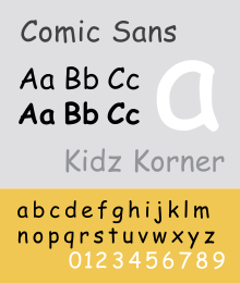
Comic sans is so ubiquitous because it is easier to read for people with reading difficulties like dyslexia. So I let people do what works for them.
https://www.boia.org/blog/does-comic-sans-benefit-people-with-dyslexia
Atkinson Hyperlegible and OpenDyslexic are both fonts that were actually designed for that. And Atkinson at least doesn't look ridiculous.
That article all but rejects your claim...
Please stop spreading this BS and the typographic crimes it enables
There is an actual opendyslexic font and it doesn't look much like comic sans. It has a very distinct heavy and light weight line to it, on a printed page the light areas barely show.