46
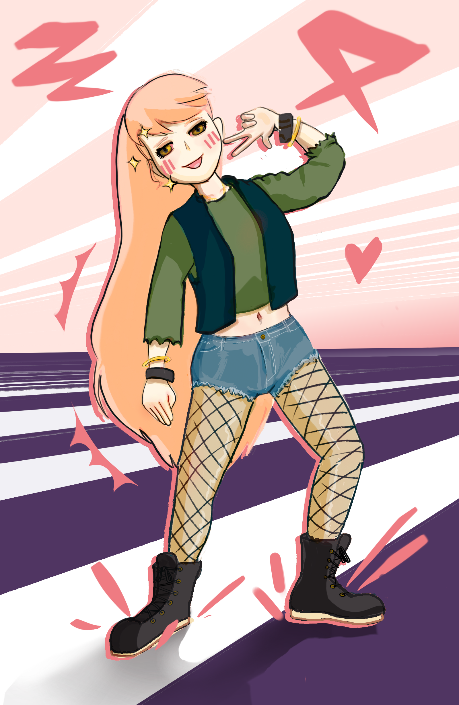
I struggle with proportions, this is the first one In a while I genuinely think I did alright
(sh.itjust.works)
This is a friendly community for everyone who wants to share their art with the world! Everyone is welcomed 🎨
Rules
AI Art: While we appreciate AI generated art, there are more appropriate communities to post that type of art to. Please keep posts to non-AI generated art only. This rule includes AI art that was then manually manipulated (e.g. drawing on top of something generated by AI).
Nudity: Nudity is and has always been a part of art, but it may be something that some users don't wish to see or cannot view in certain circumstances (e.g. at work). If your work contains nudity, please mark it as NSFW. Work that contains nudity that is not marked as NSFW will be taken down. As long as the NSFW tag is used, we welcome nude subject matter.
Spam: Please do not spam this community. Self promotion is fine if you just want people to be aware of your work, but blatant attempts at spam will result in the past being removed and possibly a ban. If you aren't sure if what you are posting is spam, please contact the moderator first.
Conduct: Be nice, and don't be a jerk. Constructive criticism is OK, but don't be mean. Encouragement is always welcomed.
Please tho if you have constructive criticism I absolutely crave it, I'm a big boy I can take it
You did a very good job. The real mistakes I can easily identify with proportion are that the lowered arm and the legs are slightly too short, and the foot on the left is a bit too long. The pose looks a little stiff, but an easy fix for that is making the shoulders and the pelvis less parallel. The posing of the hands are kind of stiff as well, but hands are hard, and they look good enough that it's not really an issue. The bracelets on the lowered hand seem to be curved the wrong way; as it is the viewer is seeing them from the bottom, but in relation to the viewer's point of view you should be seeing the top. The shorts are basically perfect, 10/10. Lighting and shadow looks flat, like it's not following the shape of the body and clothes, but that's something I personally struggle with so I can't offer much help there. One thing I would change (personal preference) is to push the colors of the lights and shadows more. As it is, the value and saturation changes from light to dark, but there's not much shifting in hue. Nudging the the light values a bit closer to the color of the light, and nudging the shadow values the opposite way will make the colors pop. Take all this with a huge grain of salt. I am a hobbyist and not a pro.
Thanks super helpful 🙏🏻