this post was submitted on 26 Nov 2024
156 points (89.0% liked)
Map Enthusiasts
3852 readers
52 users here now
For the map enthused!
Rules:
-
post relevant content: interesting, informative, and/or pretty maps
-
be nice
founded 2 years ago
MODERATORS
you are viewing a single comment's thread
view the rest of the comments
view the rest of the comments

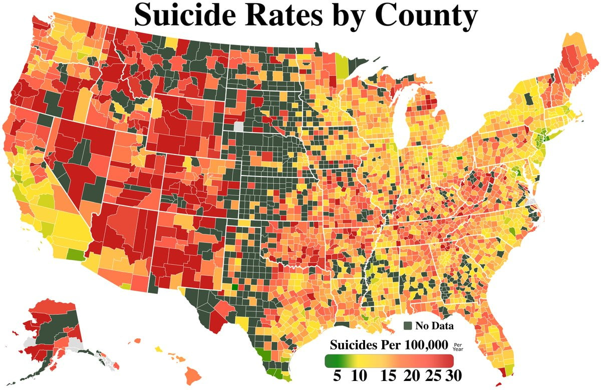
Why did they make the “no data” color nearly identical to the low value of the range? And yet there are still counties marked grey, which is what they should have picked for missing data.
I am curious about the source for this. Very strange and unhelpful.
I'm colorblind and the low end and high end look exactly the same to me .