this post was submitted on 15 Nov 2024
294 points (94.0% liked)
Linux
50208 readers
689 users here now
From Wikipedia, the free encyclopedia
Linux is a family of open source Unix-like operating systems based on the Linux kernel, an operating system kernel first released on September 17, 1991 by Linus Torvalds. Linux is typically packaged in a Linux distribution (or distro for short).
Distributions include the Linux kernel and supporting system software and libraries, many of which are provided by the GNU Project. Many Linux distributions use the word "Linux" in their name, but the Free Software Foundation uses the name GNU/Linux to emphasize the importance of GNU software, causing some controversy.
Rules
- Posts must be relevant to operating systems running the Linux kernel. GNU/Linux or otherwise.
- No misinformation
- No NSFW content
- No hate speech, bigotry, etc
Related Communities
Community icon by Alpár-Etele Méder, licensed under CC BY 3.0
founded 5 years ago
MODERATORS
you are viewing a single comment's thread
view the rest of the comments
view the rest of the comments

I tried to do a couple of icon sets that went with that trend for KDE. At one point I was involved with the KDE VDG and was about to set the style of the icons they'd use.
But apparently some suit told them they needed to go completely flat as they needed to plaster Firefox/distros/whatever logos on it, so everything needed to look consistent.
So in the end I got bored about it and stepped away. I'm trying to redo a new square-shaped-skeumorphed icon set but it's so much work - like it'd need to be your daily job to pull it off.
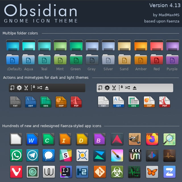
However, if you take a look at it, it's already in this one - some of them are just the base shape with some logo plastered on it (like the whatsapp one, or the one with the butterfly) and voilá, there's your icon.
So icon sets are incredibly hard, and if you want a skeumorphism icon set its hard squared. That's another of the reasons flat icons thrive today.