this post was submitted on 24 Jul 2024
23 points (96.0% liked)
Connect for Lemmy App
2661 readers
17 users here now
A community for the mobile app Connect for Lemmy.
Links
founded 2 years ago
MODERATORS
you are viewing a single comment's thread
view the rest of the comments
view the rest of the comments

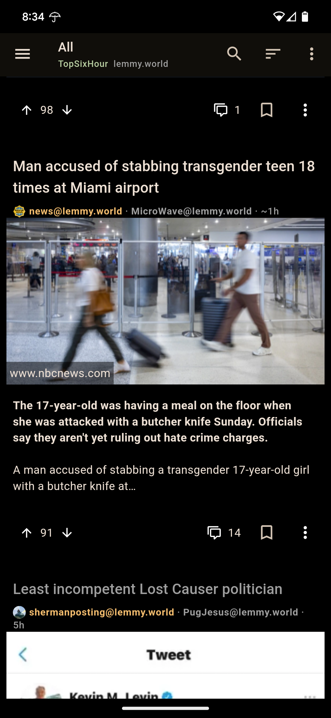
I also miss the defined borders between cards. When I first opened the app this morning I thought I was looking at an extended screenshot and was confused what the gag was until I realized it was just the UI that had gone crappy.
Yeah gimme my cards back! Now it's basically just FULL WIDTH minus a few pixels. And minus any sort of dividing line. It's gotta be a mistake