Yeah, I think I'd consider a parallel GitHub repo that spits out nightly builds
machinaeZER0
Bake em away, toys
Absolute banger. Always loved Bowie's collabs in this era. His version of Disco King with Maynard James Keenan gives me chills everytime.
Icon looks great, Thunder is capitalized! Material You is working beautifully, though I might consider having it theme the floating New Post button as well?
AMAZING release, dude!
Not Rorschach!
I can do that! :)
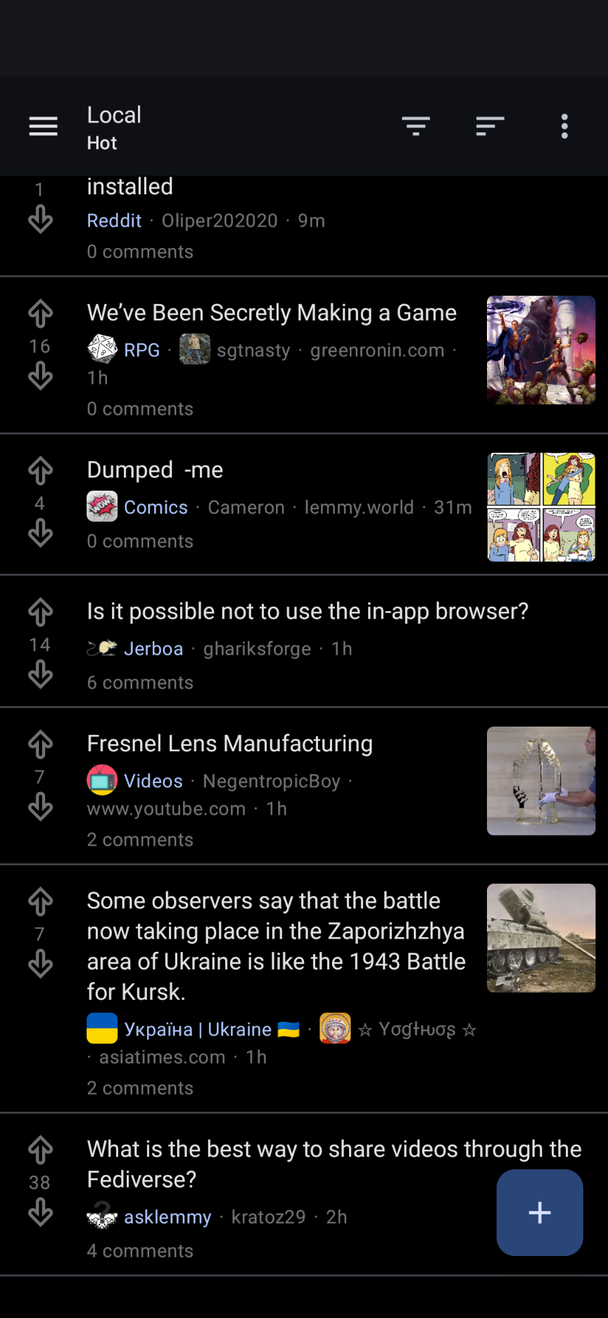
Screenshot of the accent-colored community name in Jerboa's feed (I like that yours doesn't also show the community icon, much cleaner looking!):

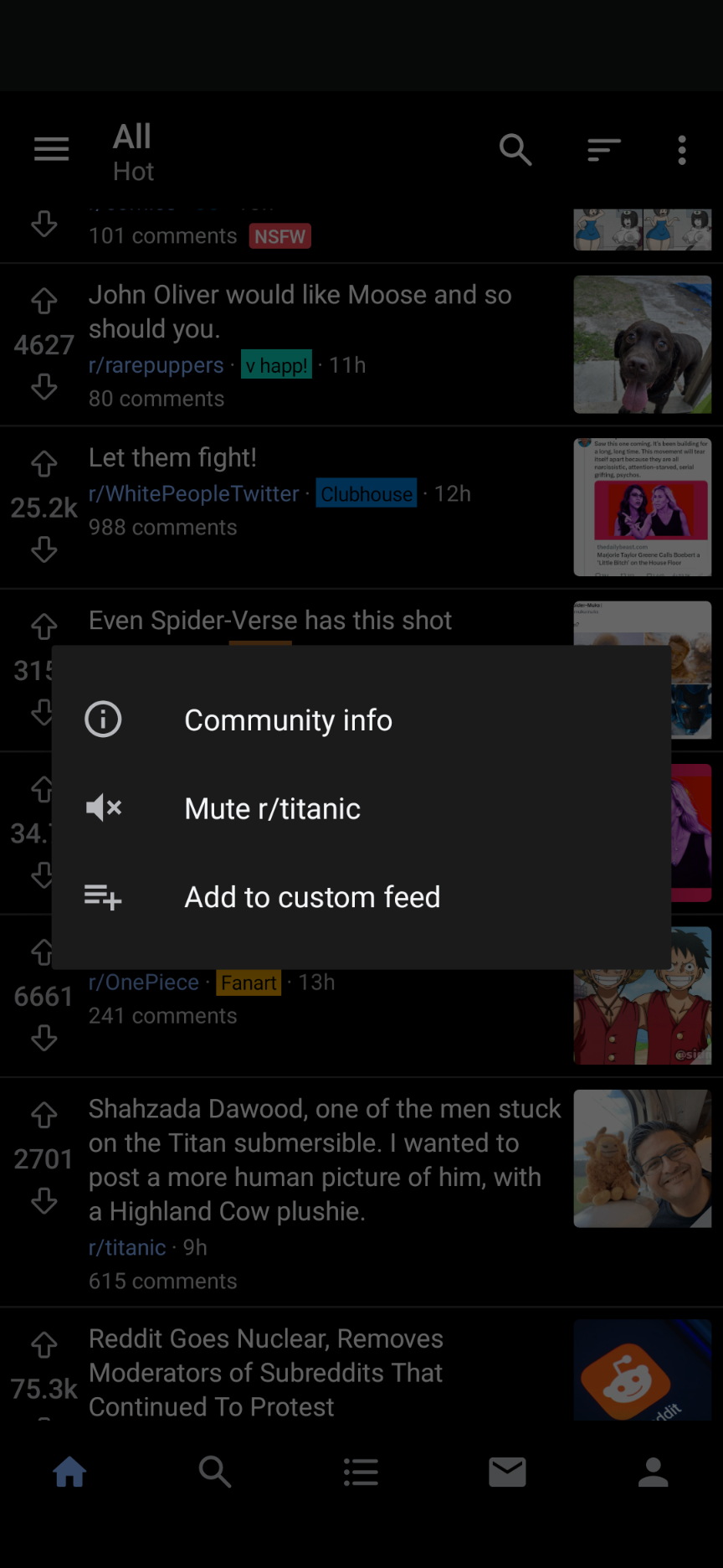
And a screenshot of Boost's popup menu on community long-press:

Compact mode is so goooood. This is seriously one of the best looking Lemmy apps by far :)
- I wouldn't mind if the bottom nav bar slid offscreen as I scrolled through my feed - a few other apps do this which I do like. It slides back in usually if you scroll back up a little
- would love some up/down arrows to navigate through parent threads in comment view (bonus points if holding down the up arrow brings you back to the top of the post!)
- it would be cool if we could select the accent color of the app (currently seems to be purple?) - some other apps offer the option for this to pull the system accent color on Android which is pretty neat!
- I noticed that images on my feed autoplay if they're animated, and I think if possible it would be cool to have a toggle to not have these autoplay? Personal preference, but also probably a good place to save data
- I'd mentioned it in another post, but eventually would love the option to have thumbnails on the right side in compact mode
- one small tweak I'd suggest coming from jerboa - they color the community name on a post to help it stand out a bit from the title and instance and other info (I think with the accent color?)
- a feature request coming from Boost for Reddit - in that app you can long-press the community name on a post in-feed for a popup menu in which you can quickly block/hide that entire community from your feed, without clicking through to that community. Huge time saver!
Sorry for the wall of text, but hope there's some helpful/constructive stuff in there. Thanks for building such an awesome experience here!
EDIT: added some screenshots to explain a few points above. I'd also consider moving account view/account switcher into the side panel (some other reddit/lemmy apps do this as well), while keeping home/search/notifications/settings in the nav bar, since one may be less likely to need immediate access to that menu?
Beautiful!
Great work! Heck of a game. Hope the anime comes back soon...
Holy shit!!!! I thought Ruben was switching over to making smaller projects... This is amazing!