It's not worse. My point was it's not better either.
what's the need for big icons alongside text?
why have a grid like structure than keep the old format and improve upon the original listed fornat with a better presentation?
Current format does not impress in both aesthetic and practical use
My suggestion would be to use the original format (listed in a chronological order), reduce the icon size to the same size as the texts so they don't appear like big blocks taking more space than necessary. Also for any custom notes bring a drop down feature that can hide and show with the floor text without a separate list in the order
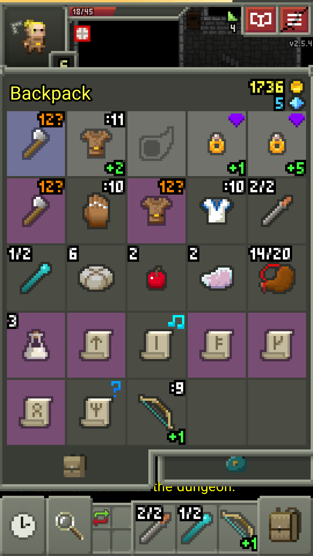


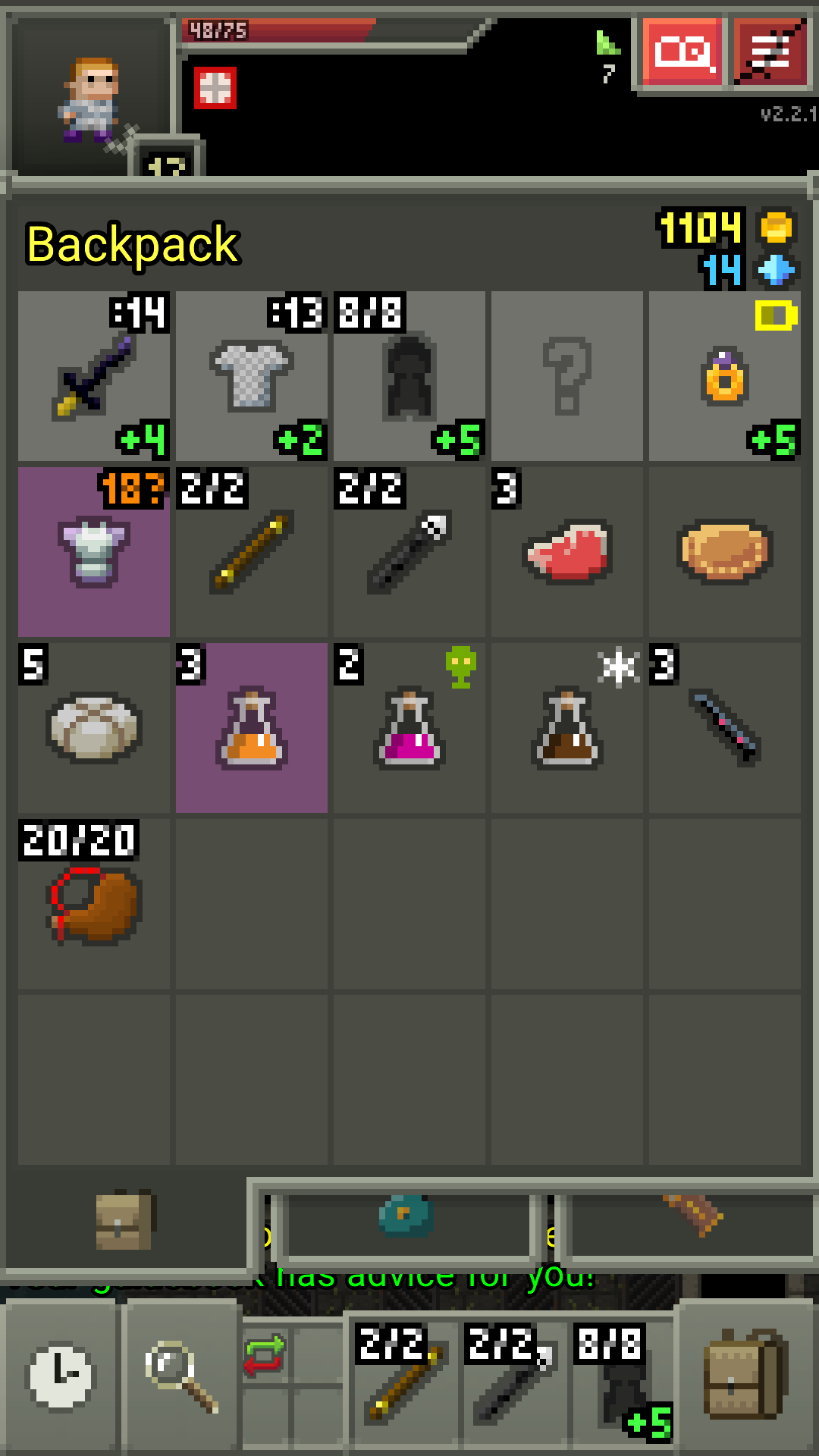

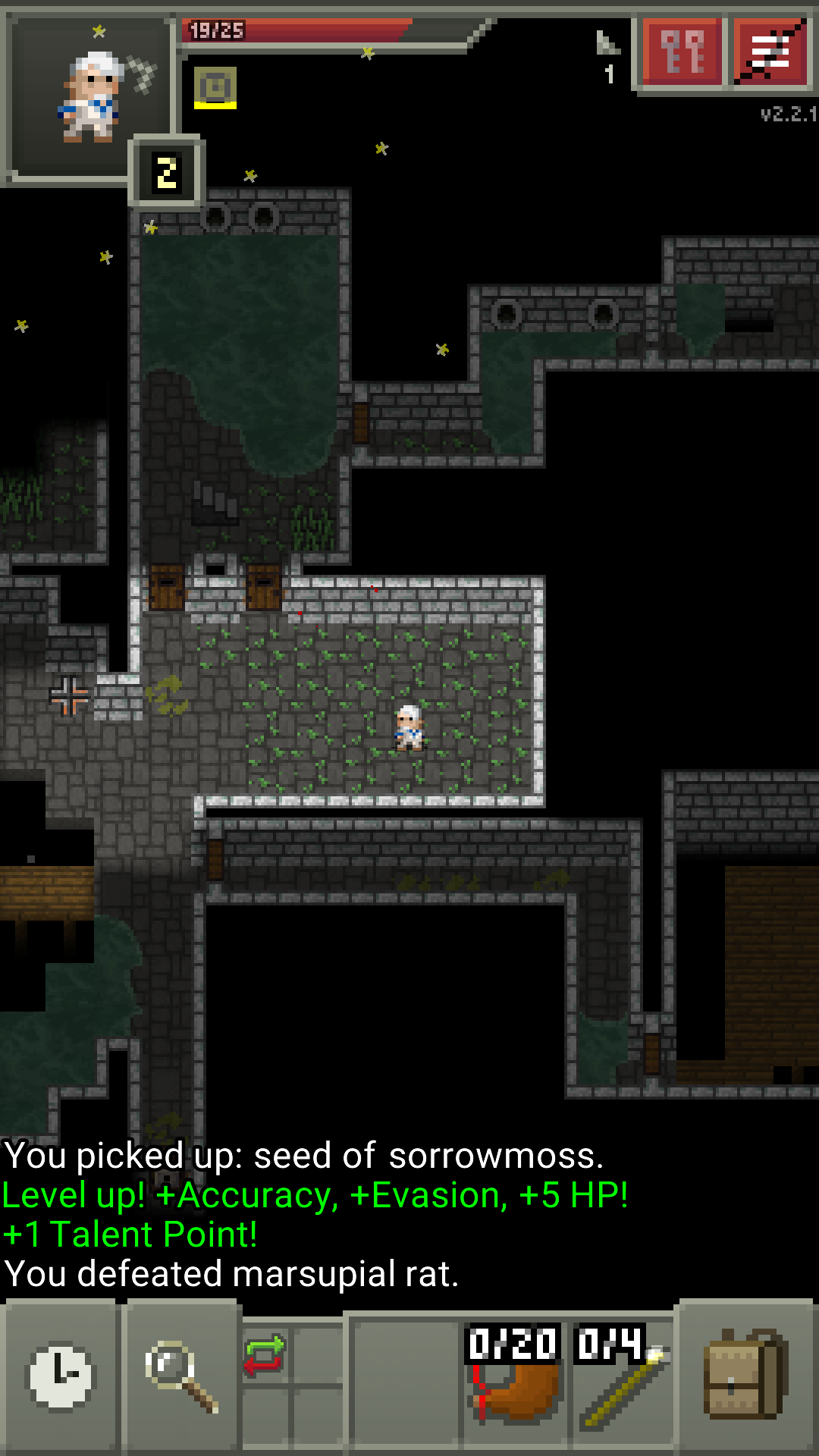


After playing with both rings equipped I can confirm Row+1 plus Row+5 = Row+7 (+1 is added on top of +6)
So it means when two rings are equipped there's a transfer of max +1 (capped) to second ring
Formula: Ring+1 plus Ring+2 plus 1 (transfer) = Ring+4