LabPlot
Thank you for all your comments. A jittering of data points along the x-axis was used to avoid over-plotting. But yes, a scatter plot with a boxplot attached along the y-axis (to show outliers) may be more informative in this case.
A boxplot is a 1-dimensional plot. The data points are jittered along the x-axis to make them less crowded.
More on boxplots here:
➡️ https://labplot.kde.org/2021/08/11/box-plot/
➡️ https://userbase.kde.org/LabPlot/2DPlotting/BoxPlot
Since July you can enjoy the new 2.11.1 version of #LabPlot, an open-source data analysis and visualization software.
Check your current version and ask your package maintainer to provide the latest version for your #Linux and #FreeBSD distribution.
➡️ https://repology.org/project/labplot/versions
#DataAnalysis #Statistics #Research #Ubuntu #LinuxMint #ArchLinux #Slackware #Debian #Fedora #OpenSUSE #RedHat #HaikuOS #GNU #CentOS #FreeSoftware #OpenSource #Manjaro #Zorin #FOSS #FLOSS #KDE
We used #LabPlot, a free, open source and cross-platform data visualization and analysis software.
LabPlot's homepage:
➡️ https://labplot.kde.org/
Video tutorials:
➡️ https://www.youtube.com/@LabPlot/videos
Any exploratory plot forms a question and your comment shows how to look for answers. Thanks!
You can read more on boxplots here:


@[email protected]
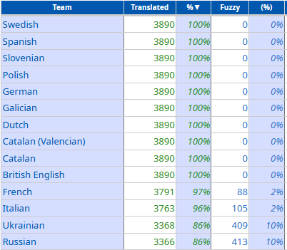
#LabPlot is now also fully available in Ukrainian and French! Thank you ❤️🙂
The following translations still need some work... And other languages need a bit more work 😉