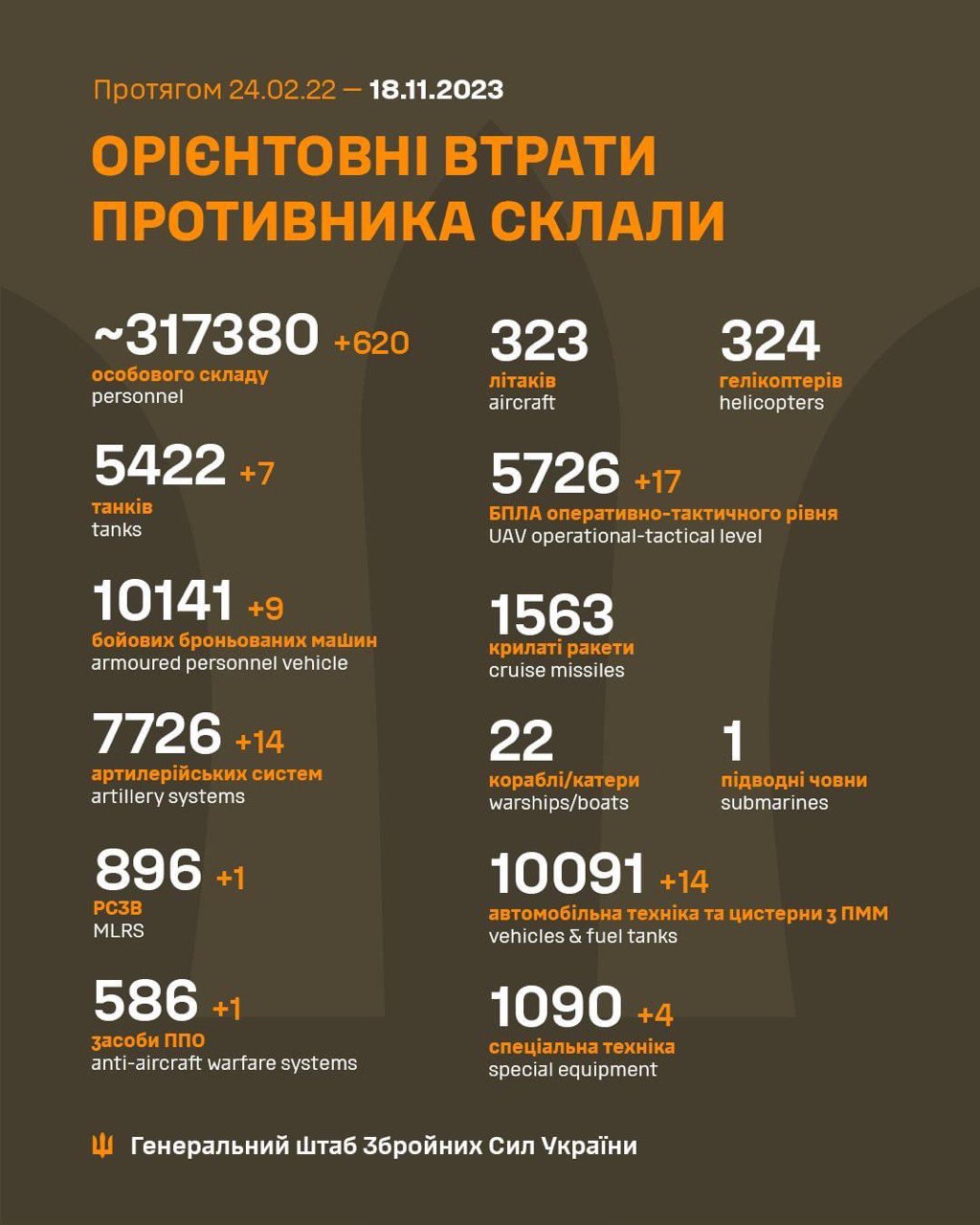
Why post this? Everyone knows that loss reports generated by the opposing military force are inflated, just as their own self-reported losses will be deflated.
That's NOT unique to this conflict, and sure, Russian reports on Ukrainian loses are comically ridiculous, but still, I don't see the value in these infographics - except as copium and/or propaganda.
Not trying to be a dick, but I genuinely don't understand why these data points are used, except as the maximum value for OSINT analysis on loss estimate ranges.
EDIT: NOT unique to this conflict.