this post was submitted on 14 Oct 2023
110 points (97.4% liked)

ErgoMechKeyboards

5767 readers
31 users here now

Ergonomic, split and other weird keyboards

Rules

Keep it ergo

Posts must be of/about keyboards that have a clear delineation between the left and right halves of the keyboard, column stagger, or both. This includes one-handed (one half doesn't exist, what clearer delineation is that!?)

i.e. no regular non-split¹ row-stagger and no non-split¹ ortholinear²

¹ split meaning a separation of the halves, whether fixed in place or entirely separate, both are fine.
² ortholinear meaning keys layed out in a grid

No Spam

No excessive posting/"shilling" for commercial purposes. Vendors are permitted to promote their products/services but keep it to a minimum and use the [vendor] flair. Posts that appear to be marketing without being transparent about it will be removed.

No Buy/Sell/Trade

This subreddit is not a marketplace, please post on r/mechmarket or other relevant marketplace.

Some useful links

founded 1 year ago
MODERATORS
 

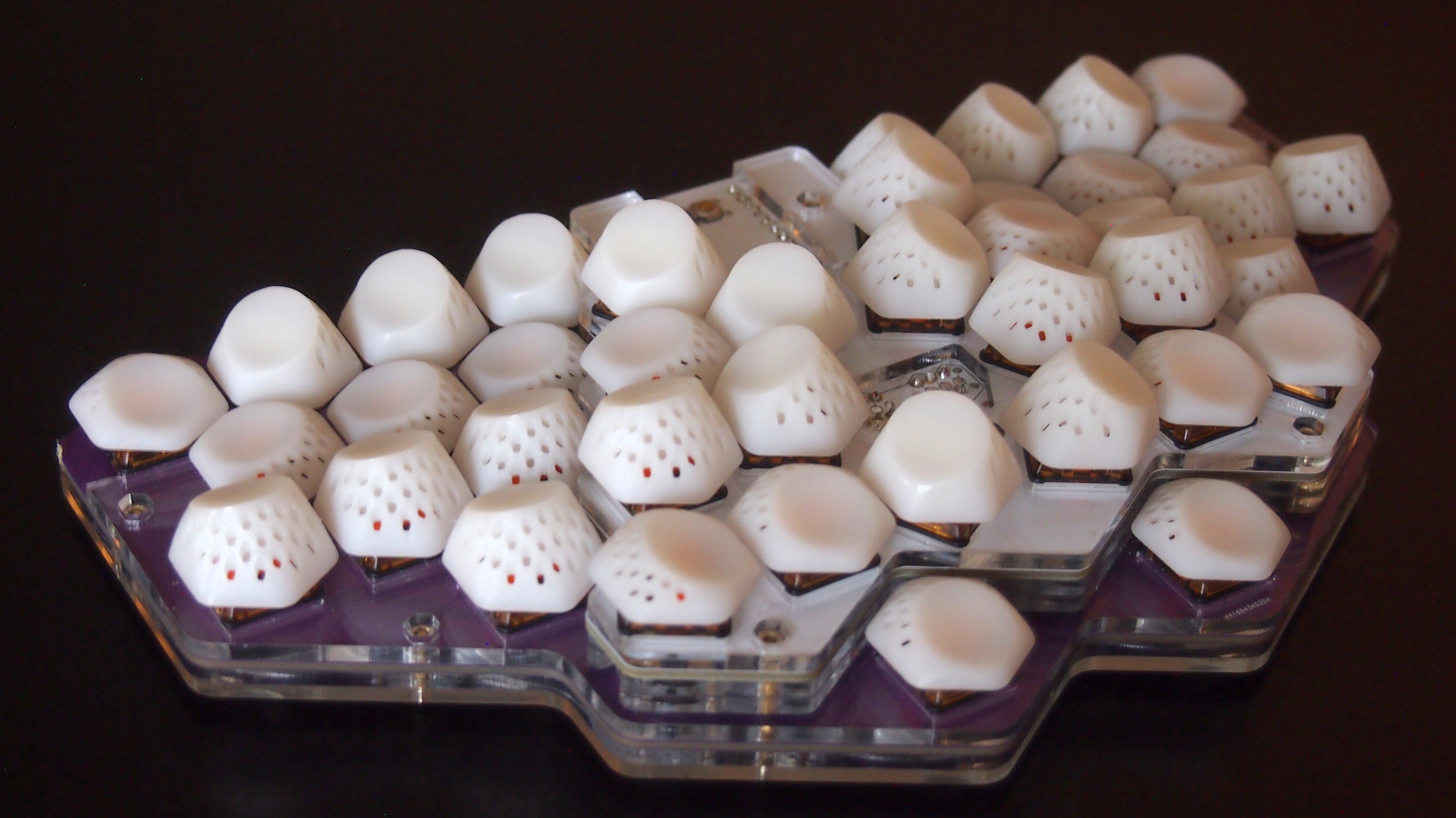
I updated the 3D-printed keycaps for my Mantis v0.3 keyboard to create more sculpted keywells that require less finger movement for typing.

Thanks to the rotation of the switches on the PCB, this needs only two different keycap profiles, a flat one with 15° tilt of the dish, very similar to the keycaps I had printed for the first prototype, and a tall one with 28° tilt.

The flat keys are used on the home row, the outer pinky key and most thumb keys. The tall ones are used on the remaining keys. I'm not quite happy with the rotation of the inner index finger keys with the taller key profile. Fixing that will require a revision of the PCB, if I want to keep the number of distinct key profiles to just two.

I was able to print these keys very cost-effectively at JLCPCB, by joining 10 keys in a single 3D object. For the flat keys it brings the cost down to 30 cents per key. This leads to more imperfections than printing individual keys, but they are mostly cosmetic and don't affect the usability. The savings are worth it for me to make several prototype keyboards cost effectively.

The updated 3D models, including 10-key versions are on GitHub.

all 15 comments
sorted by: hot top controversial new old
[–] SinningStromgald 56 points 11 months ago (2 children)

Those keycaps look like teeth and creep me out.

[–] crawley 16 points 11 months ago

If it wasn't on this community it would belong in c/trypophobia

[–] some_guy 20 points 11 months ago (4 children)

This looks like it belongs in eXistenZ

[–] [email protected] 5 points 11 months ago (1 children)

now we just need to order "The Special"

[–] seaQueue 6 points 11 months ago

This keyboard really needs an umbilical looking cable to go along with the keycaps.

[–] luckybipedal 4 points 11 months ago

Thank you for the reference. I just watched the movie for the first time. I mean I was going for an organic looking shape with these keycaps, but maybe I succeeded a bit more than I intended. I should make a "special" version for Halloween.

[–] [email protected] 1 points 11 months ago

This is a movie I wanted to hate, because of how odd it was, but I loved it.

[–] harry_nola 1 points 11 months ago

oh wow! yeah great reference!

[–] [email protected] 12 points 11 months ago

I'm impressed, and I love how this project is pushing the boundaries for keyboard layouts, but damn if this doesn't make me uncomfortable

[–] [email protected] 8 points 11 months ago

Really cool! They kind of look like botfly larvae

[–] [email protected] 1 points 11 months ago* (last edited 11 months ago) (1 children)

These look amazing! Do you have any more pictures of them installed?

[–] luckybipedal 4 points 11 months ago

The title picture and the first picture in my post both show them installed. Here is a direct link to the title picture.

[–] [email protected] 1 points 9 months ago (1 children)

That looks absolutely crazy, I love it! Like some kind or teeth or something

[–] luckybipedal 2 points 9 months ago

Yeah, I wasn't really happy with the height and sharp edge of the taller keys. The latest version flattens that a bit. It still has the lower half a spherical dish facing the key well, but flattens out above that. This makes it more versatile as a thumb key as well.

https://github.com/fxkuehl/mantis/raw/main/assets/mantis-v0.3-leds.jpg

https://github.com/fxkuehl/mantis/blob/main/keycap/keycap-v3-28.stl