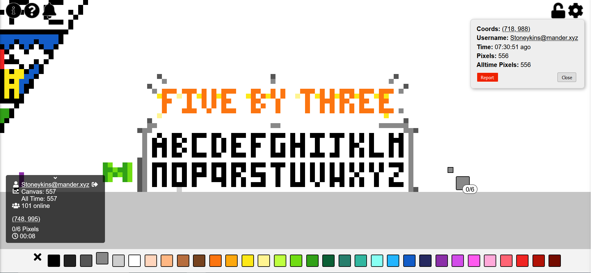
this post was submitted on 05 Aug 2023
111 points (99.1% liked)

Canvas

527 readers
57 users here now

Canvas — The Fediverse’s r/place


July 12th, 2024 @ midnight EDT

Countdown

Was on August 4th (12:00am EST) - 6th (11:59pm EST) Thank You Post


Links

Timelapses

founded 11 months ago
MODERATORS
 

I've been doing this. Now everyone will know the superior small block letter font in which every letter fits into 5 by 3 pixels. I challenge you to show me a better small block letter font in which every letter fits into 5 by 3 pixels!

also I'm still trying to make it look nicer but it was taking a while so I figured I should explain why I made this

shoutout to [email protected] I like your green M

update: not done yet, but I wanted to ask people's opinions on the J. any consensus on which is better?

top 15 comments
sorted by: hot top controversial new old
[–] [email protected] 12 points 10 months ago (1 children)

The J above the OR seems better

[–] [email protected] 3 points 10 months ago

people do seem to prefer that one. I'll probably change it after I get the color stuff done, to give more time for people to weigh in.

[–] AnUnusualRelic 6 points 10 months ago (1 children)

This doesn't seem to be Unicode compliant.

[–] [email protected] 1 points 10 months ago

fair lol.

It's just for pixel art/writing though. I used to use it in minecraft a lot.

[–] [email protected] 4 points 10 months ago

Thankyou. Was planning on writing something in the canvas too.

[–] [email protected] 4 points 10 months ago (1 children)
[–] [email protected] 7 points 10 months ago

DEBATABLE THAT THEY EVEN EXIST. I'M NOT SURE I'VE EVER EVEN SPOKEN TO A LOWERCASE LETTER BEFORE IN MY ENTIRE LIFE!

(actually I just didn't want to monopolize TOO much space on my personal random font thing. if you wanna make a version for small letters, I encourage it.)

[–] AToM_exe 4 points 10 months ago (2 children)

I don't like the J. It's too similar to the I.

[–] [email protected] 5 points 10 months ago

⬜️⬜️🔳 ⬜️⬜️🔳 ⬜️⬜️🔳 🔳⬜️🔳 🔳🔳🔳

Better?

[–] [email protected] 4 points 10 months ago (1 children)

lots of the letters are pretty similar, but they are, in my experience, still pretty easy to tell apart when reading. Trying to get them all the same size did make it hard to make them as individual as I might have liked, but I think it has advantages.

i tried making the center of the J down the right side, but it looked lopsided... I didn't like it.

if you have a better idea for J I'd like to see it (this reads as snarky but it's genuine lol. I really would like to improve this if possible).

[–] [email protected] 2 points 10 months ago

Your J looks good to me.

[–] sanguinepar 3 points 10 months ago

Just spotted this, which I quite like - the person doing it is using 4x3, which still works, although it does mean the M and H are the same, and no space at the top of E or F

[–] sanguinepar 3 points 10 months ago* (last edited 10 months ago) (1 children)

Oh, hey neighbour! I'm right next to you (the DAFC badge - which doesn't adhere to 5x3, I know)

I like the J with the bar over it more than the other one, but both work.

[–] [email protected] 3 points 10 months ago (1 children)

I won't hold your font choices against you.

...much.

[–] sanguinepar 2 points 10 months ago