this post was submitted on 16 Apr 2024
54 points (98.2% liked)

Denver

1109 readers
1 users here now

A place for discussions about Denver, CO.

Rules:

  1. No bigotry: Including racism, sexism, homophobia, transphobia, or xenophobia. Code of Conduct.
  2. Be respectful. Everyone should feel welcome here.
  3. No NSFW content.
  4. No Ads / Spamming.
  5. Be thoughtful and helpful: even with ‘stupid’ questions. The world won’t be made better or worse by snarky comments schooling naive newcomers on Lemmy.

founded 1 year ago
MODERATORS
 
top 2 comments
sorted by: hot top controversial new old
[–] vestigialthorn 2 points 2 months ago* (last edited 2 months ago) (1 children)

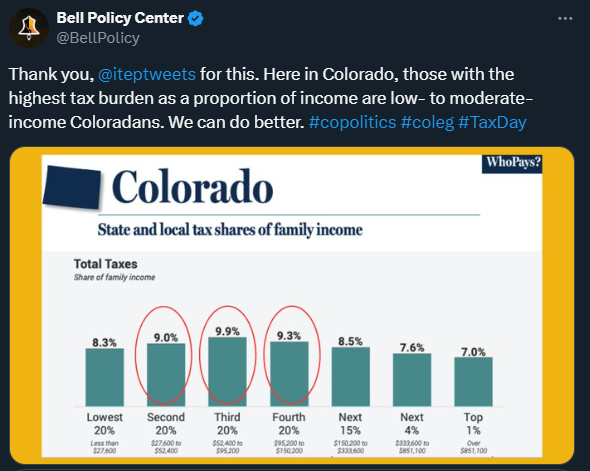
Edit: I have since realized that I am unsure on the calculation of tax burden is calculated for the chart.

I am skeptical of the representation of the data. My sense for ways to skew data is set off when making statements of segments of population when the segments are not comparable.

I would need a better understanding of the calculation of the values reported to be able to justify that the top 20% are split into smaller groups than they’re being compared to.

[–] [email protected] 4 points 2 months ago

You can easily lump them together again and see that it would add up to 8.2% for the top 20% incomes. I think they’ve made subdivisions to highlight that it’s skewed even within that group, with the richer people having a lower tax burden.