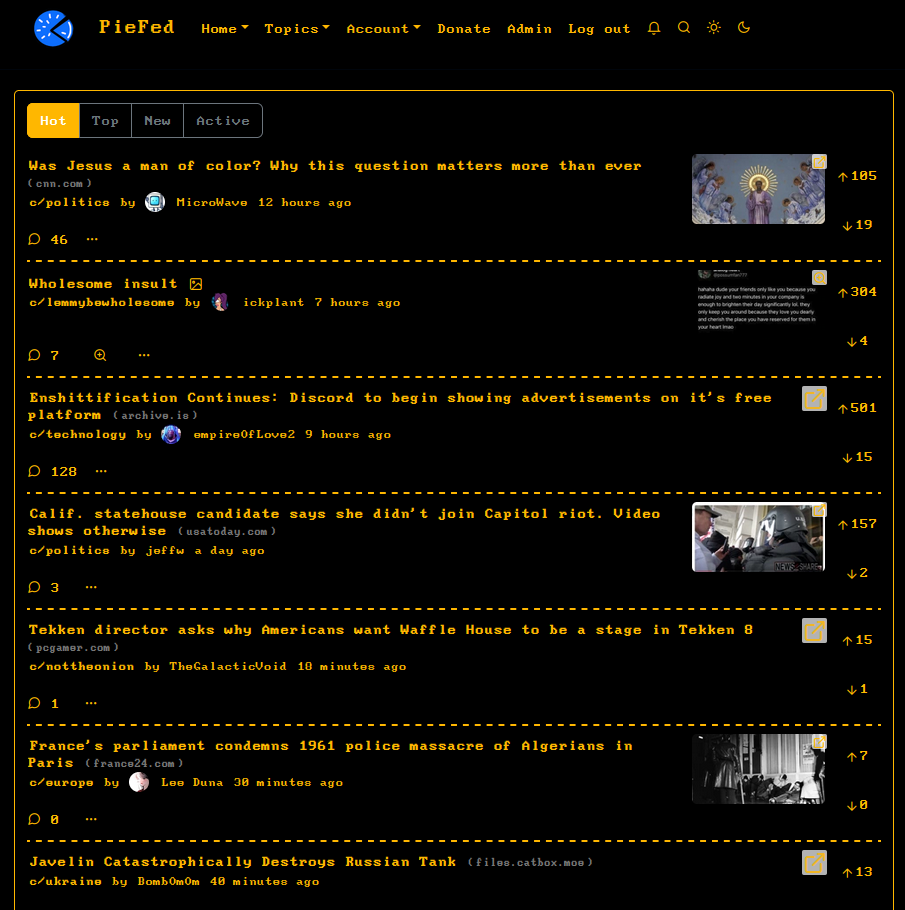
Totally awesome!
PieFed Meta
Discuss PieFed project direction, provide feedback, ask questions, suggest improvements, and engage in conversations related to the platform organization, policies, features, and community dynamics.
Wiki
I'm using the amber version atm, it's kinda funny to see it on my phone.
I didn't realise it was possible to overwrite the templates using themes - that offers some interesting possibilities!
I absolutely adore this, thanks for making it! :D
EDIT: Oddly, I'm kind've struggling with the font. I usually have no problem with vintage pixelated fonts, but something about this one is just hard for my eyes to read. I do love the amber though.
It could be because the font I'm using only really works at one size: 14px. That was the number of pixels on the screens in the 80s. I made a quick attempt at normalising the fonts to be this size but there are a lot of areas which I missed or decided to leave a bit smaller/bigger. The pixelated headings are disappointing, tho.
If anyone has any font suggestions which are identical to the IBM PC font AND which scale better, I'm all ears.
I found a couple, but I'm not sure which would be best.
This 'Less/More perfect DOS VGA' font looks like it might be good.
And this site here seems to have a wide variety of IBM PC fonts, which seems to be available from their downloads page as one big file.
Yes, 'Less perfect' looks better. The change in pixel shape between CRT and LCD was the issue. I've put that into the theme instead. Thanks!
