this post was submitted on 01 Apr 2024
11 points (100.0% liked)
PieFed Meta
170 readers
1 users here now
Discuss PieFed project direction, provide feedback, ask questions, suggest improvements, and engage in conversations related to the platform organization, policies, features, and community dynamics.
Wiki
founded 9 months ago
MODERATORS
you are viewing a single comment's thread
view the rest of the comments
view the rest of the comments

I found a couple, but I'm not sure which would be best.
This 'Less/More perfect DOS VGA' font looks like it might be good.
And this site here seems to have a wide variety of IBM PC fonts, which seems to be available from their downloads page as one big file.
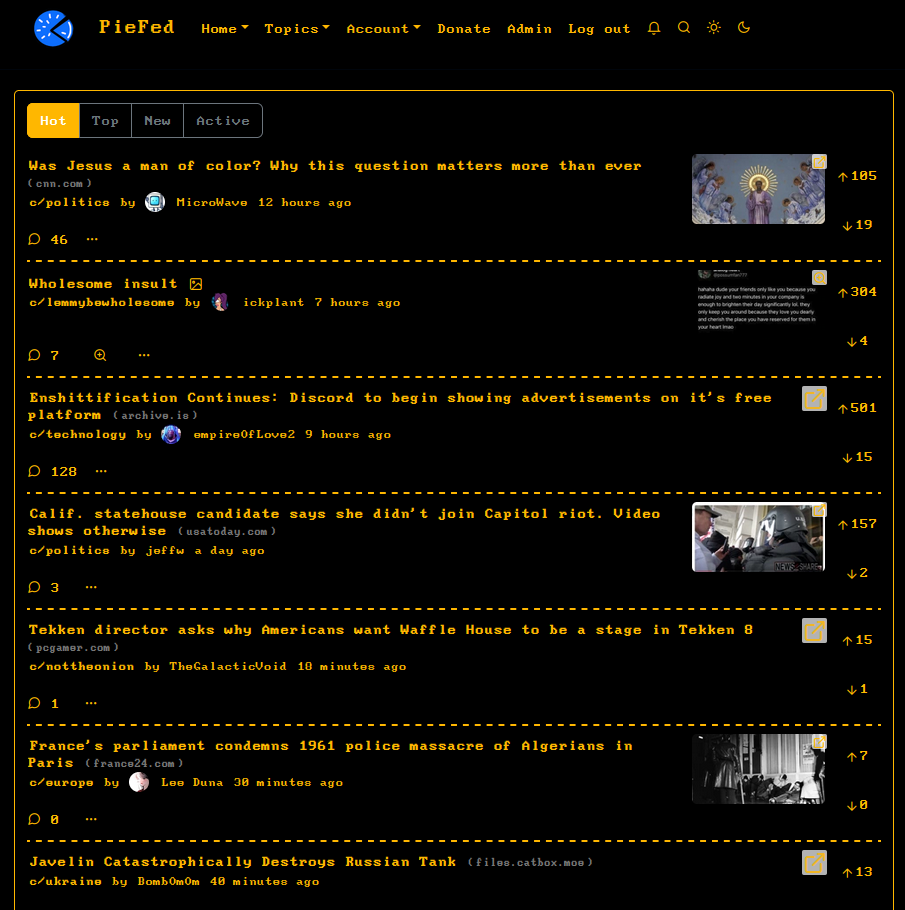
Yes, 'Less perfect' looks better. The change in pixel shape between CRT and LCD was the issue. I've put that into the theme instead. Thanks!