Photography
c/photography is a community centered on the practice of amateur and professional photography. You can come here to discuss the gear, the technique and the culture related to the art of photography. You can also share your work, appreciate the others' and constructively critique each others work.
Please, be sure to read the rules before posting.
THE RULES
- Be nice to each other
This Lemmy Community is open to civil, friendly discussion about our common interest, photography. Excessively rude, mean, unfriendly, or hostile conduct is not permitted.
- Keep content on topic
All discussion threads must be photography related such as latest gear or art news, gear acquisition advices, photography related questions, etc...
- No politics or religion
This Lemmy Community is about photography and discussion around photography, not religion or politics.
- No classified ads or job offers
All is in the title. This is a casual discussion community.
- No spam or self-promotion
One post, one photo in the limit of 3 pictures in a 24 hours timespan. Do not flood the community with your pictures. Be patient, select your best work, and enjoy.
-
If you want contructive critiques, use [Critique Wanted] in your title.
-
Flair NSFW posts (nudity, gore, ...)
-
Do not share your portfolio (instagram, flickr, or else...)
The aim of this community is to invite everyone to discuss around your photography. If you drop everything with one link, this become pointless. Portfolio posts will be deleted. You can however share your portfolio link in the comment section if another member wants to see more of your work.
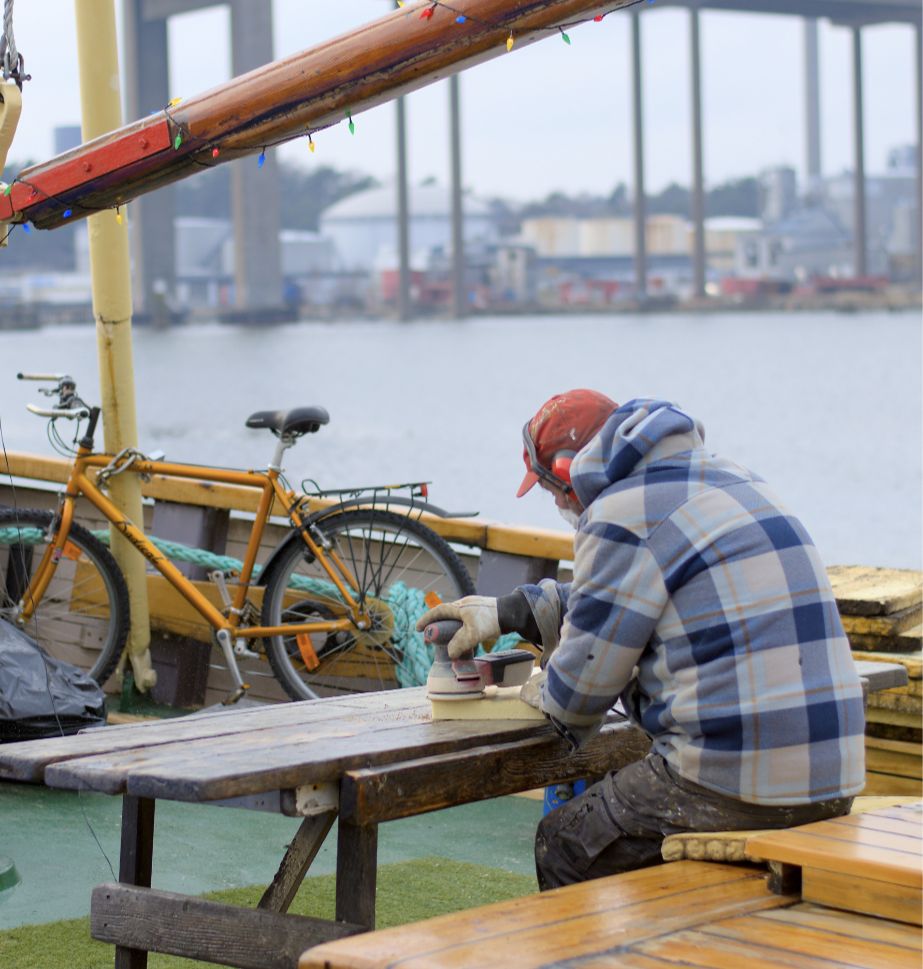
What I feel is that the central subject doesn't stand out (I actually don't know who/what the central subject is, more precisely). The man for some reason seems to blend into the surroundings. May be some color correction might make it better.

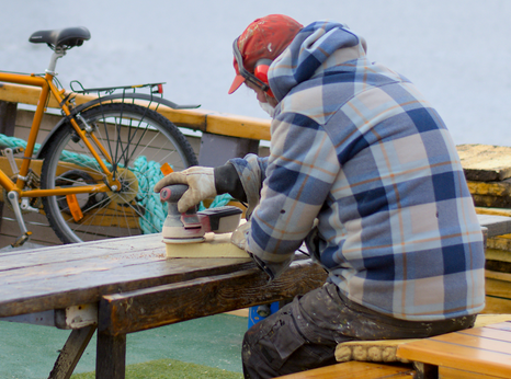
I think a crop like this is all it needs. I like the colour and balance in this version. It's quiet and contemplative while at the same time showing motion, activity.
I like it!
What were you trying to achieve and what would you like critique on?
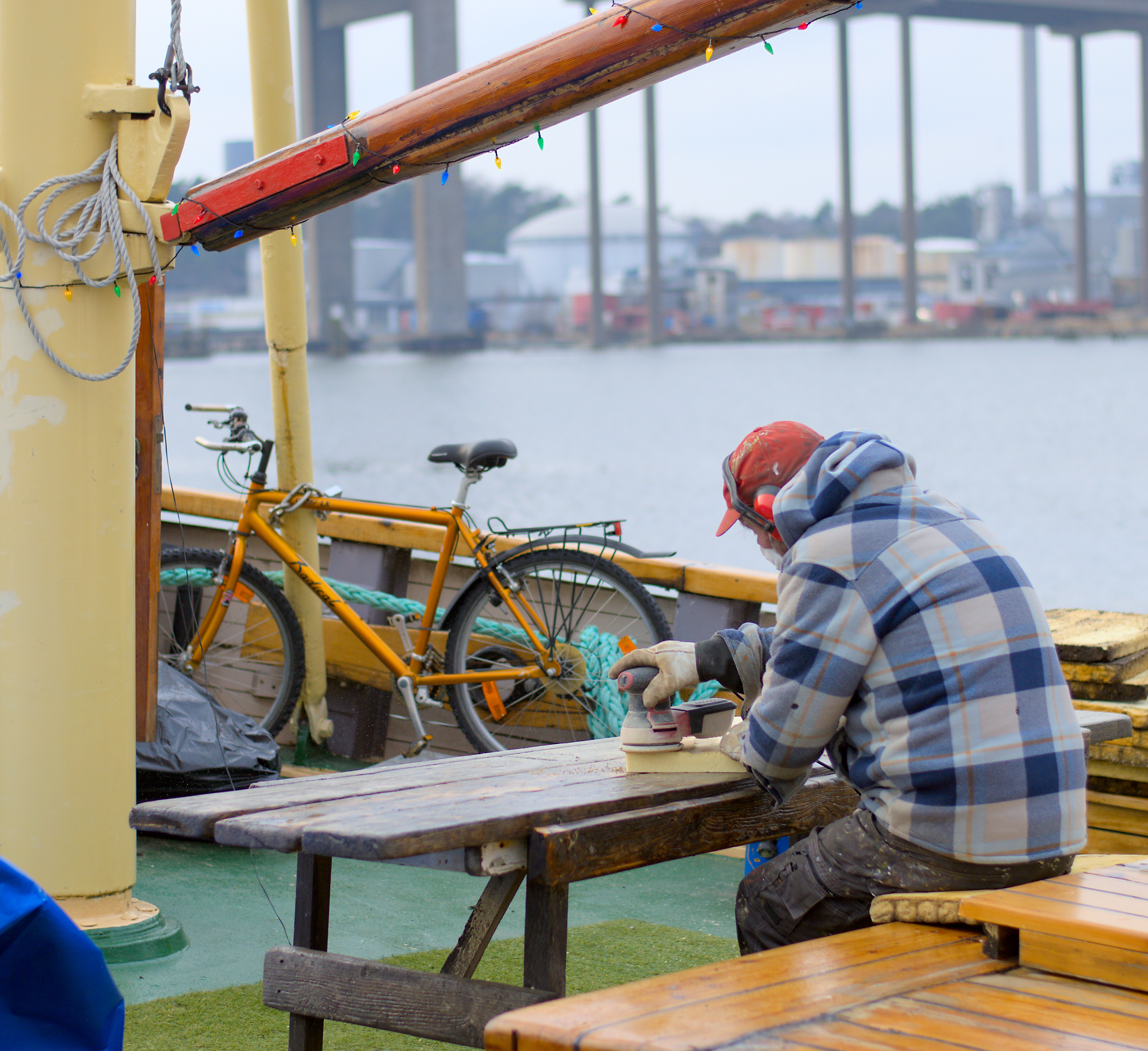
Generally? I like the scene - and ironically I love the colors. The reds, yellows and blues are nice. But it's rather busy overall for me. The bicycle is on equal footing visually with the man and competes for attention. The blue/red items in the left-side corners are bright enough to pull my attention to the edge and away from the man as well.
I feel like I want more of the "man" and less of the "stuff on the boat".
I cropped in on him as an example of what I'm thinking - though it does lose the port background and some context of it being a "boat":

But it's your photo. This is to my taste not yours.
Kinda agree on the noise of the bike, disagree on the crop. I enjoy how the bench, mast and beam(? Not a boat guy) frame him, focused on his work.
Not much to be done about the bike, it was there and they had to work with it.
That's fair - the loss of the mast and things were what I didn't like about losing the context.
I really liked it straight away but my eyes got confused where to look because it seems the focus of the photo, the man working, is too busy with the bike in background
Well I really like it. But if I had to crititque it, i'd say maybe a little too much happening there. A cleaner background and maybe edit out the ropes on the top left corner. Maaaybe also edit out the dead body in a bag infront of the bike. Just feels a lil too cluttered.
Really like the way youve worked with lines in the composition. Great job!
