this post was submitted on 27 Mar 2024
336 points (96.4% liked)
Open Source
33240 readers
548 users here now
All about open source! Feel free to ask questions, and share news, and interesting stuff!
Useful Links
- Open Source Initiative
- Free Software Foundation
- Electronic Frontier Foundation
- Software Freedom Conservancy
- It's FOSS
- Android FOSS Apps Megathread
Rules
- Posts must be relevant to the open source ideology
- No NSFW content
- No hate speech, bigotry, etc
Related Communities
Community icon from opensource.org, but we are not affiliated with them.
founded 5 years ago
MODERATORS
you are viewing a single comment's thread
view the rest of the comments
view the rest of the comments

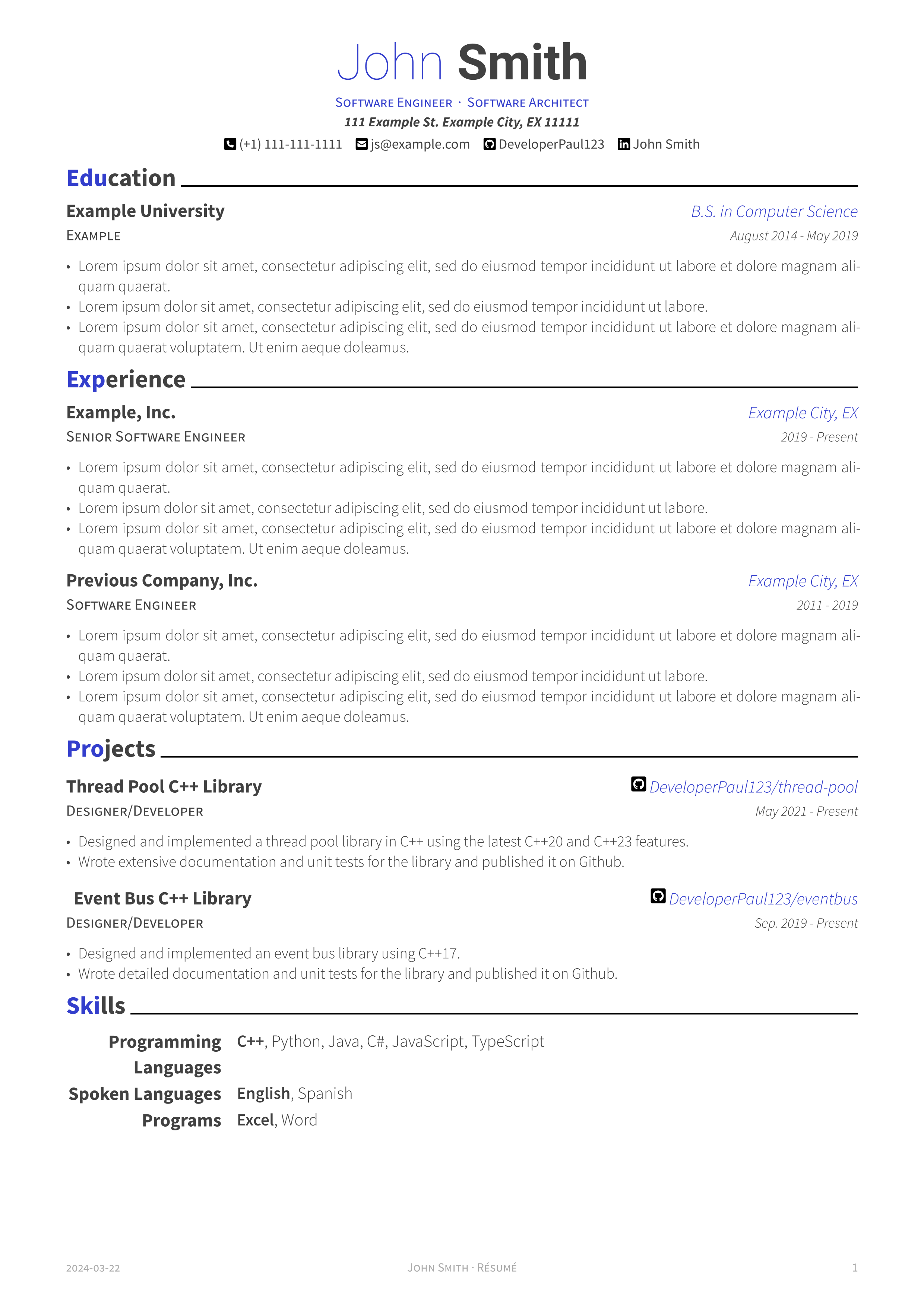
This looks good.
A few unsolicited nit-picky suggestions;
Engine Mechanic
Bob's Auto | City, ST | 2017-2021
Education does not need so many details (if relevant to job, include specific courses and projects). Grad date can be omitted to help obfuscate you're age (a grad from 2024 is probably inexpirenced, while a 1967 grad is going to be retiring soon).
Two lines is all you need;
Bob's University, City, ST
B.S. Computer Science, minor electrical enginnering
Thanks for all the feedback! I'll take each point into consideration as I work on the next version of the template :)
I'm working on some of the changes your suggested. Here are screenshots of the adjustments. I'm curious to hear your thoughts. Thanks!
Here is a monochrome version without colored headers. I also adjusted the default accent color, but this is user configurable as well.
It looks a lot cleaner now.
The body text seems too light still, but that might be my phone screen. It should be solid black.
~~Only~~ One change from here I would strongly recommend making is the blue "city" text black.
Treat blue and bold text as your 'highlighter', there to help someone quickly navigate to the important sections of the page. City is not important. Your use of varriying font sizes and bullet lists is great for page navigation.
If I was going to use color, I'd highlight the jobs before the city name/git link.
The rest is personal taste.
Personally, I think the blue headers is enough. It might get to too blue if you color job titles as well. You don't need a separate monochrome version, the dark blue will show as black if it happens to be printed in B&W. You should also test print your resume in B&W. I find easier to spot errors on paper.
Edits as I spot more little things.
(Also there's an extra space in the second skill name - Event Bus)
(You also have space to make programming languages one line. At first glace I though you had a blank section for "languages". Could probably just say "programming", but I'm not in that field so maybe that's frowned upon?)
(In education, you have an example line underneath the university name, what is that line for? I would put the degree in that space, not off to the side. That's technicaly more important that the university it self, but it's probably "improper form" to list that above the uni name. (or whatever some one snoby would say).
(One last thing, you don't really need your full street address. Its unlikely anyone will mail you a response, and its just as likely you'll have to enter it into the application form anyways. City will suffice.)
(One last last thing, if you're going to give yourself titles at the top, you better show them in your expirence section. (I know this is just an example template and I am being incredibly picky) but I don't see architect anyware in the actual resume. That communicates to me you're just calling yourself related titles hoping one sticks)