this post was submitted on 30 Dec 2023
124 points (90.8% liked)
Sync for Lemmy
15135 readers
16 users here now
👀
Welcome to Sync for Lemmy!

Welcome to the official Sync for Lemmy community.
The rules for posting and commenting, besides the rules defined here for lemmy.world, are as follows:
Community Rules
1- No advertising or spam.
All types of advertising and spam are restricted in this community.
Community Credits
Artwork and community banner by: @[email protected]
founded 1 year ago
MODERATORS
you are viewing a single comment's thread
view the rest of the comments
view the rest of the comments

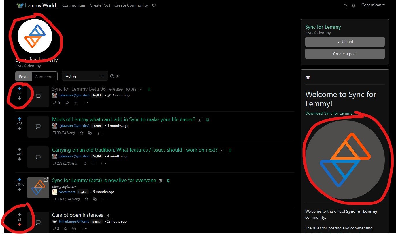
I do as someone that uses both the Lemmy web interface (as well as photon interface) and Sync App. I actually get confused because there are instances where score is only color coded without an up/down indicator. So color coding consistency is nice across app and web.