Humor
"Laugh-a-Palooza: Unleash Your Inner Chuckle!"
Rules
Read Full Rules Here!
Rule 1: Keep it light-hearted. This community is dedicated to humor and laughter, so let’s keep the tone light and positive.
Rule 2: Respectful Engagement. Keep it civil!
Rule 3: No spamming!
Rule 4: No explicit or NSFW content.
Rule 5: Stay on topic. Keep your posts relevant to humor-related topics.
Rule 6: Moderators Discretion. The moderators retain the right to remove any content, ban users/bots if deemed necessary.
Please report any violation of rules!
Warning: Strict compliance with all the rules is imperative. Failure to read and adhere to them will not be tolerated. Violations may result in immediate removal of your content and a permanent ban from the community.
We retain the discretion to modify the rules as we deem necessary.
view the rest of the comments

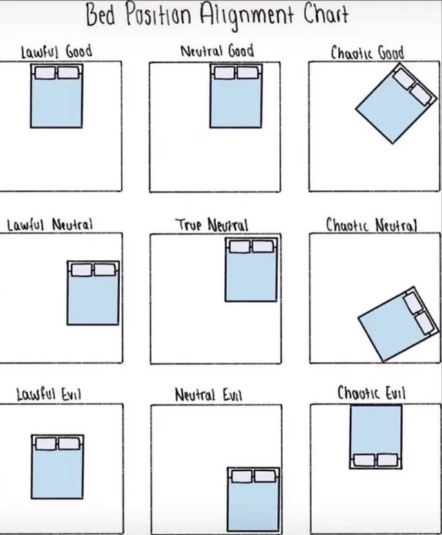
That would also make sense, it would just be changing the pattern.*
In mine, Lawful is center aligned with one side touching a wall. Chaotic is tilted to touch corners to walls instead of sides. Good is head towards walls and foot towards the interior. Evil is foot towards walls and head towards the interior. And true neutral... is not bound by any of these rules.
* A pattern that would be based on the idea that neutral should be a defined side, one that presents its own rules in each dimension of the chart, rather than merely being the absence of one of the other alignment dichotomies. If this were just about chart making, I would support that as I like things to be orderly, but because this is alignment I stick with what I believe to be the better representation of that system.