this post was submitted on 30 Oct 2023
108 points (95.8% liked)
Don't Dead - Open Inside
1174 readers
1 users here now
Images of text-designs, that are barely readable due to the placement of the words or letters
Please indicate which post is original by writing "OC" and properly credit stolen posts.
Please mark NSFW posts properly, don't spam, yadadadada
founded 1 year ago
MODERATORS
you are viewing a single comment's thread
view the rest of the comments
view the rest of the comments

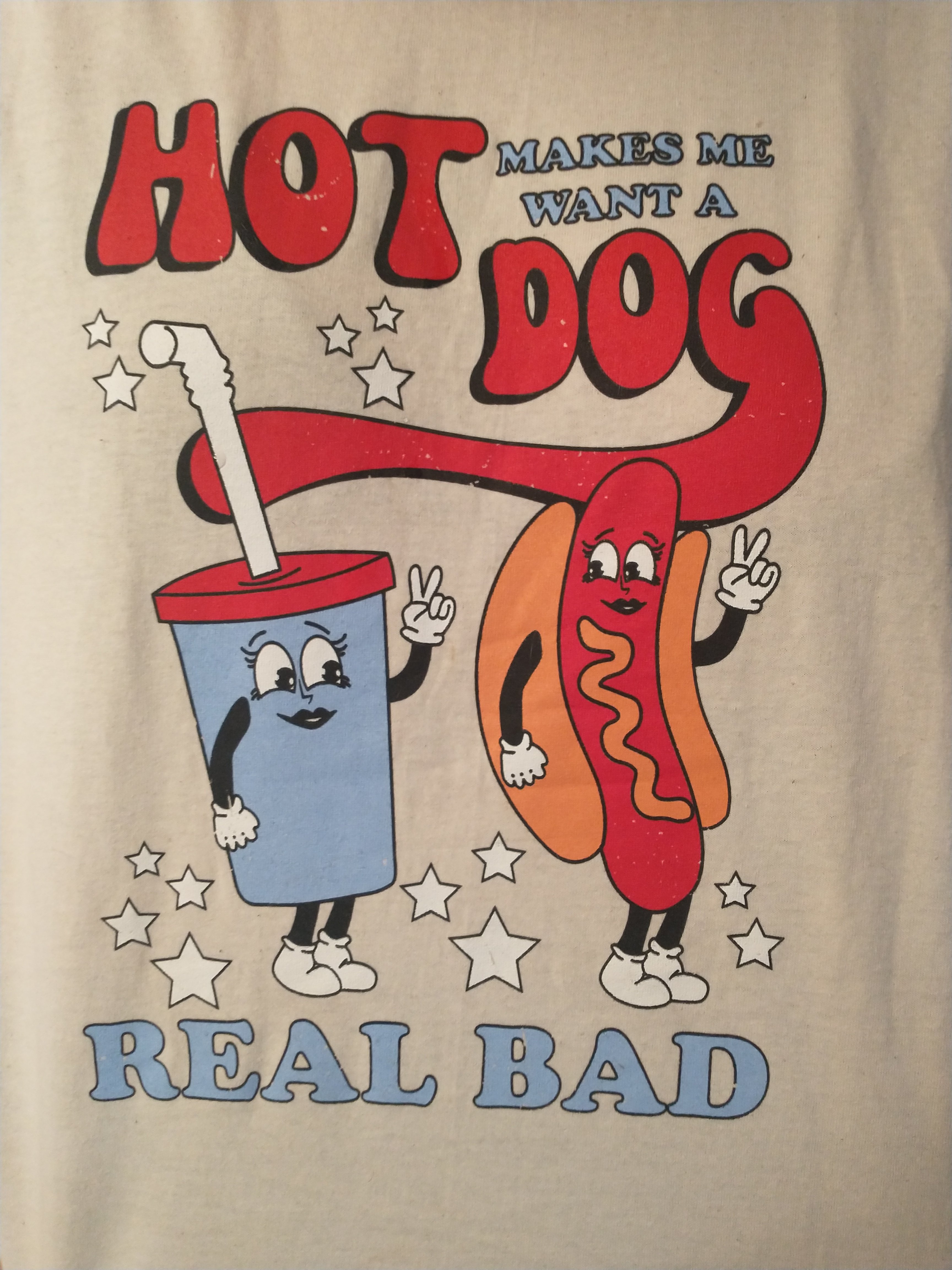
I don't want to be pedantic because I love this community, but as a designer, it's clear that the ad makes of multiple techniques to differentiate between "makes me want a" and "hot dog".
Unfortunately, the colour, size, font weight and position of "hot dog" draws the eye far more than "makes me want a". It suggests prominence and that the reader should start with it. It therefore reads
"Hot Dog makes me want a real bad"
Which then does work for this sub...
I don't want to be pedantic because I appreciate your astute analysis, but as a fan of classic movies, it's clear that this isn't an ad, but rather a t-shirt referring to a humorous line from Legally Blonde.
Unfortunately, the composition of the photograph omits the sleeves and neck of the shirt, and the design evokes the imagery and aesthetic of advertisements for 1960's drive-in theater concession stands, so it is easy to mistake it for an ad.
Ultimately, the main point of your comment, that the phrase is still difficult to read even though the words "Hot Dog" are grouped together, still stands.
Which then does work for this post...
Oh that's pretty cool! I've never seen the legally blonde films but glad to make the link
Ha fair point, but I guess I made my point more specifically at the title of the post lol