this post was submitted on 09 Aug 2023
26 points (96.4% liked)
Photography
4549 readers
2 users here now
A community to post about photography:
We allow a wide range of topics here including; your own images, technical questions, gear talk, photography blogs etc. Please be respectful and don't spam.
founded 1 year ago
MODERATORS
you are viewing a single comment's thread
view the rest of the comments
view the rest of the comments


Interesting trio.
The first photo I like - horizontal and vertical lines everywhere and a clear line to the the centre and probably as well lit as possible.
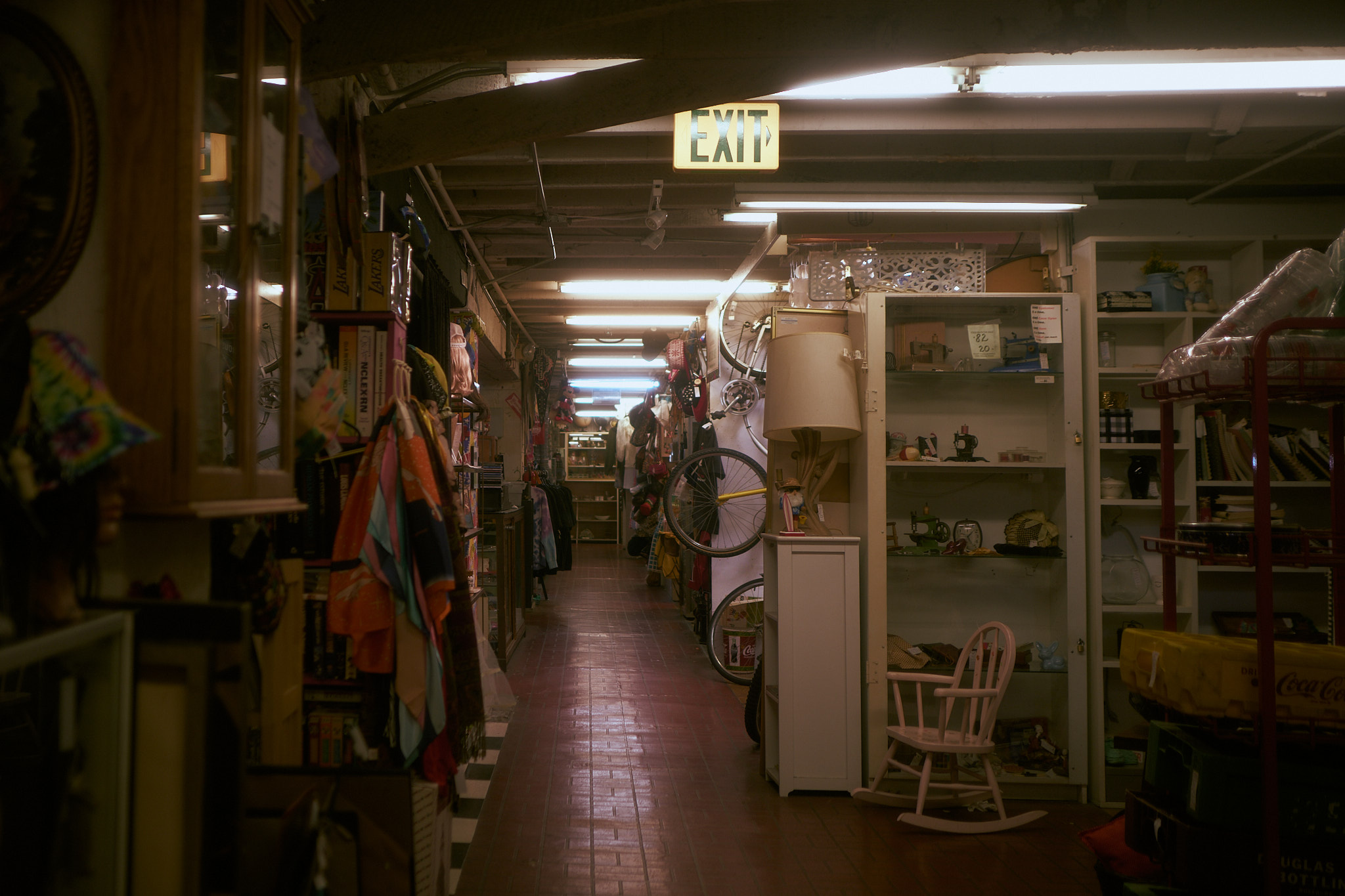
The second might benefit from boosting the colour in the photo: I'm guessing your memory is of somewhere far more colourful. Other than that, I think the composition in OK.
The third doesn't work for me: I'm guessing the concentrated patches of light were what caught your eye, and I think there's a good photo lurking in there somewhere, but the stair railings and fuzzy foreground stuff are rather distracting.
Thanks for the critique!
2 tough call, I felt like it gave a flea market feel if I raised the saturation too much, I could have probably played with vibrancy more. Definitely a very desaturated scene in general though
3 I enjoyed the maximalist quality of everything here, sort of a lost in the crowd feeling
2nd photo - if you experimented with colour, then that's all I could hope for - it's your art, after all, not mine!
3rd photo - fair enough: I could certainly see there was something good there, and it's not like you could rearrange the shop for a better composition.