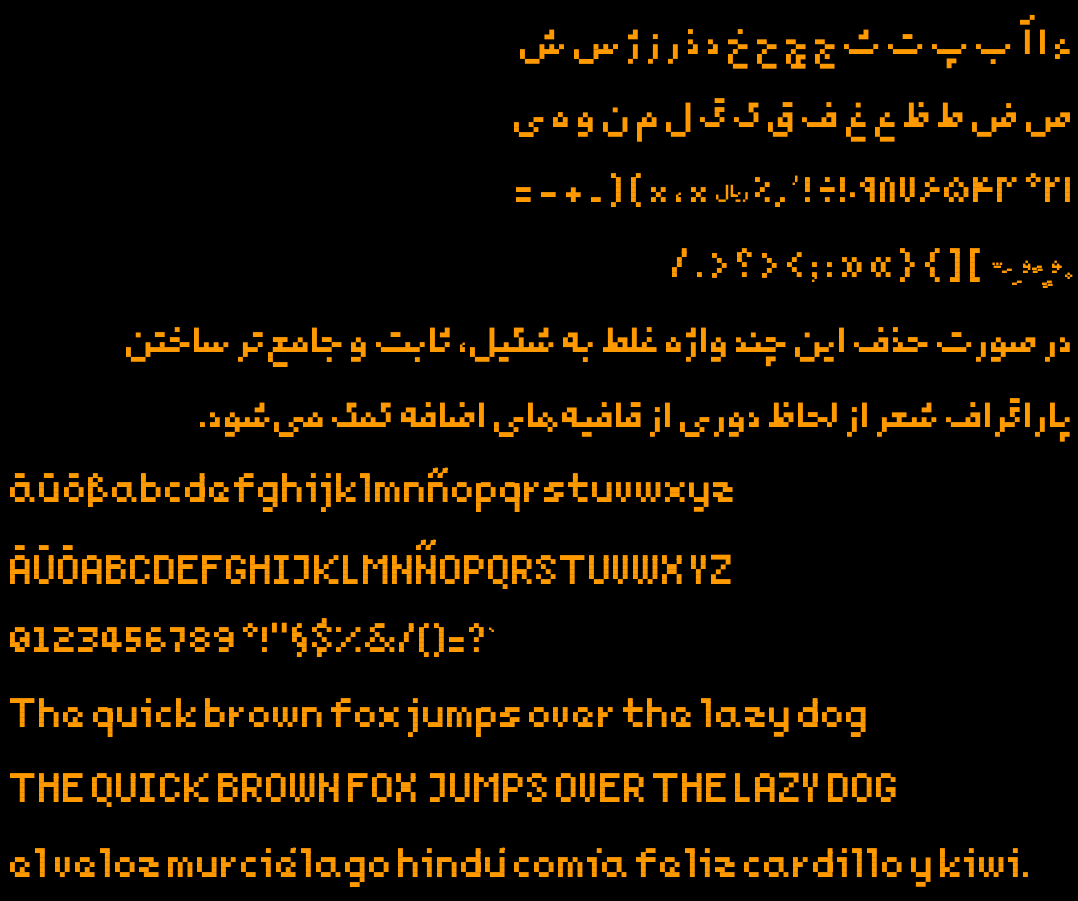
this post was submitted on 27 Jul 2023
20 points (100.0% liked)
Typography & fonts
90 readers
1 users here now
A community to discuss and share information about typography and fonts
Sibling community:
Rules of conduct:
The usual ones on Lemmy and Mastodon. In short: be kind or at least respectful, no offensive language, no harassment, no spam.
(Icon: detail from the title of Bringhurst's Elements of Typographic Style. Banner: details from pages 6 and 12, ibid.)
founded 2 years ago
MODERATORS
you are viewing a single comment's thread
view the rest of the comments
view the rest of the comments

I'm away from keyboard so can't really experiment with them now, so I'll try asymmetric form again, but make no promises :-)
Thanks for the kind words!