this post was submitted on 27 Jul 2023
20 points (100.0% liked)
Typography & fonts
90 readers
10 users here now
A community to discuss and share information about typography and fonts
Sibling community:
Rules of conduct:
The usual ones on Lemmy and Mastodon. In short: be kind or at least respectful, no offensive language, no harassment, no spam.
(Icon: detail from the title of Bringhurst's Elements of Typographic Style. Banner: details from pages 6 and 12, ibid.)
founded 1 year ago
MODERATORS
you are viewing a single comment's thread
view the rest of the comments
view the rest of the comments

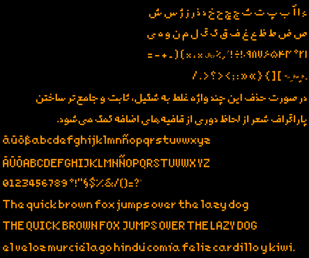
As nottheengineer pointed out, the umlauts being conjoined just doesn't feel right - your reasoning behind it makes total sense, it's just a little bit too wrong for my eyes.
I would instead personally prefer them misaligned/asymmetrical (ouch, i know) as that would make what they are clear (i would probably take a minute to adjust to that and imo that's not something that should be necessary for a typeface.
That nitpick aside, it does feel very well-rounded to look at, you did well!
I'm away from keyboard so can't really experiment with them now, so I'll try asymmetric form again, but make no promises :-)
Thanks for the kind words!