this post was submitted on 23 Jul 2023
722 points (92.2% liked)
Data Is Beautiful
1831 readers
1 users here now
A place to share and discuss data visualizations. #dataviz
(under new moderation as of 2024-01, please let me know if there are any changes you want to see!)
founded 3 years ago
MODERATORS
you are viewing a single comment's thread
view the rest of the comments
view the rest of the comments

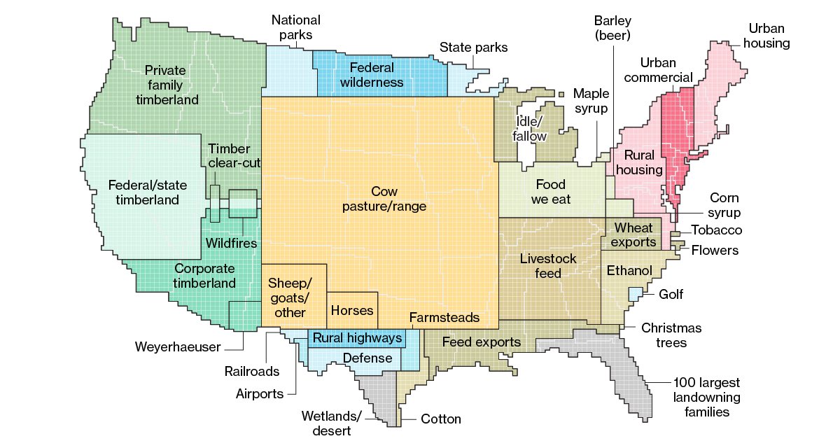
This is a weird ass pie chart using the US map as a base right? If I am correct then this is a terrible way to display this data.
Why? It gives people a relatable size and shape to compare to. Like saying the 100 richest landowners own equivalent to Florida.
I get that but it needs to be labeled some way to clarify this at least. A lot of people look at this and could easily think it is what each area has the most of and that the positions of the types of land have something to do with the states they are near or cover.
A lot of people sure keep saying "a lot of people" and getting mad at the graph instead of just laughing it off that they didn't get it at first. It's not the end of the world if you don't immediately understand something.
It's an infographic. It's purpose is to be understandable at a glance. I thought it was a pie chart then second guessed myself then read the comments and saw a lot of comments that were confused about it. You think I am saying "A lot of people" when I mean "just me I didn't get this shit at all but I am going to say a lot of people to cover that up"? Read other comments here.... a lot of comments (which I assume come from different people) seem like those writing them are confused.
I don't have any anger here. It's a random infographic. If something like this was presented to me at a job where I needed a clear concise answer immediatley and my job depended on me using it... then I dunno maybe anger and frustration then?
I think you are reading things into my words that are not there.
Anyway TLDR: Inforgraphics are supposed to be understandable at a glance..this one is not therefore it is not a very good infographic. I dunno why I would laugh about it either...it's an infographic.