this post was submitted on 23 Jul 2023
722 points (92.2% liked)
Data Is Beautiful
1831 readers
13 users here now
A place to share and discuss data visualizations. #dataviz
founded 4 years ago
MODERATORS
you are viewing a single comment's thread
view the rest of the comments
view the rest of the comments

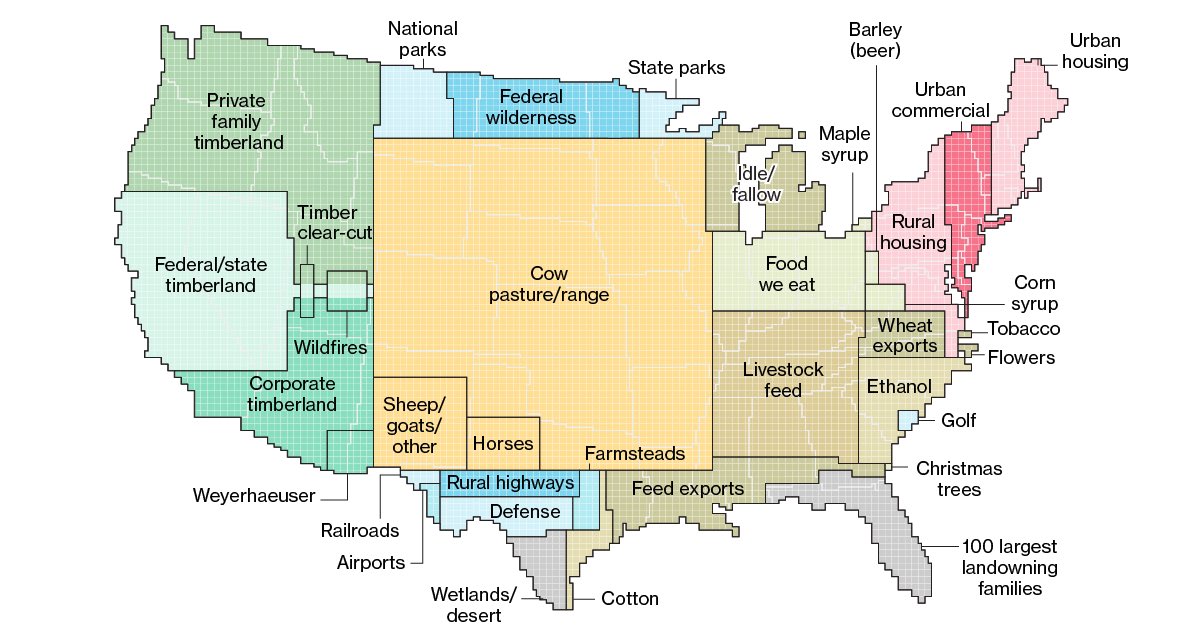
I have to tell you, there's plenty of farmed land on the entire west coast this map does not depict. Less than half of the areas labeled timberlands are forested, as a generous estimate.
Edit: as the comments under this state, I just didn't understand what was being represented and how.
I don't thing it's location specific. It's more like a pie chart where it's grouping the similar land typess together and then arbitrarily placing them on the US map.
I think the idea is, e.g. if farmed land would be a state what would be it's size?