this post was submitted on 10 Feb 2025
69 points (97.3% liked)
Data is Beautiful
5225 readers
105 users here now
A place to share and discuss visual representations of data: Graphs, charts, maps, etc.
DataIsBeautiful is for visualizations that effectively convey information. Aesthetics are an important part of information visualization, but pretty pictures are not the sole aim of this subreddit.
A place to share and discuss visual representations of data: Graphs, charts, maps, etc.
  A post must be (or contain) a qualifying data visualization.

  Directly link to the original source article of the visualization
    Original source article doesn't mean the original source image. Link to the full page of the source article as a link-type submission.
    If you made the visualization yourself, tag it as [OC]

  [OC] posts must state the data source(s) and tool(s) used in the first top-level comment on their submission.

  DO NOT claim "[OC]" for diagrams that are not yours.

  All diagrams must have at least one computer generated element.

  No reposts of popular posts within 1 month.

  Post titles must describe the data plainly without using sensationalized headlines. Clickbait posts will be removed.

  Posts involving American Politics, or contentious topics in American media, are permissible only on Thursdays (ET).

  Posts involving Personal Data are permissible only on Mondays (ET).
Please read through our FAQ if you are new to posting on DataIsBeautiful. Commenting Rules
Don't be intentionally rude, ever.

Comments should be constructive and related to the visual presented. Special attention is given to root-level comments.

Short comments and low effort replies are automatically removed.

Hate Speech and dogwhistling are not tolerated and will result in an immediate ban.

Personal attacks and rabble-rousing will be removed.

Moderators reserve discretion when issuing bans for inappropriate comments. Bans are also subject to you forfeiting all of your comments in this community.
Originally r/DataisBeautiful
founded 2 years ago
MODERATORS
you are viewing a single comment's thread
view the rest of the comments
view the rest of the comments
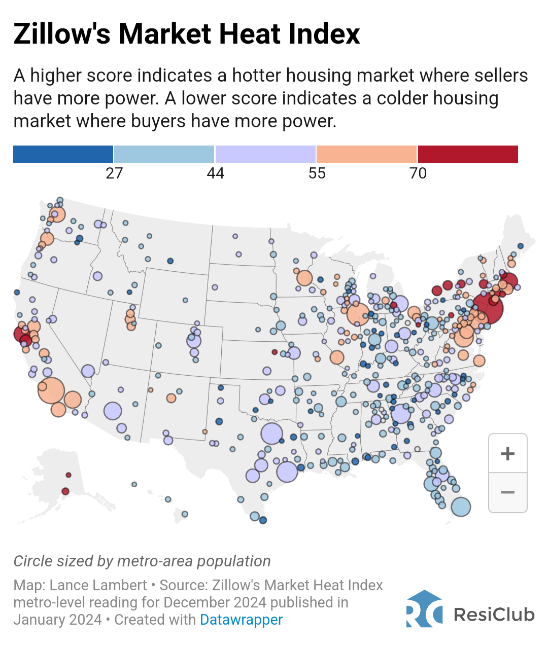
This doesn't indicate 'where people want to buy houses'.
Red indicates areas that have large numbers of interested buyers per unit, low supply levels, low time on market, some combination of that, which indicates that sellers have the ability to set the price in negotiations.
Blue indicates areas that have low numbers of interested buyers per unit, high supply levels, high time on market, some combination of that, which indicates buyers have more power in price negotiations.
The sizes of the circles only indicate the population of the area, not unsold home supply, not home sales in a given period, just the population of that area.
EDIT:
'Where people want to buy houses' would be... maybe approximated by number of pending sales or sales entertaining active bids, divided by the overall area population, or overall homes on market.
Or just polling people per location and asking them 'do you want to buy a home here?'.
EDIT 2: I randomly watched an interview on youtube that actually explained this and a bunch of other more up to date info, earlier today.
Basically, the housing bubble in many areas may finally actually be starting to let out some air... sales are extremely low, inventory is extremely high, time on market is extremely high, and sellers are actually starting to cut prices to try to find buyers.
https://www.youtube.com/watch?v=qvnDGRf_Q8M
EDIT 3:
Also worth mentioning OPs image shows Dec 2024 data.
Jan 25 data is almost certainly already compiled and available to people in the industry by now, if it isn't available publically ... pretty sure the video i linked has such.