this post was submitted on 20 Jan 2025
339 points (99.7% liked)
Data is Beautiful
1375 readers
6 users here now
Be respectful
founded 7 months ago
MODERATORS
you are viewing a single comment's thread
view the rest of the comments
view the rest of the comments

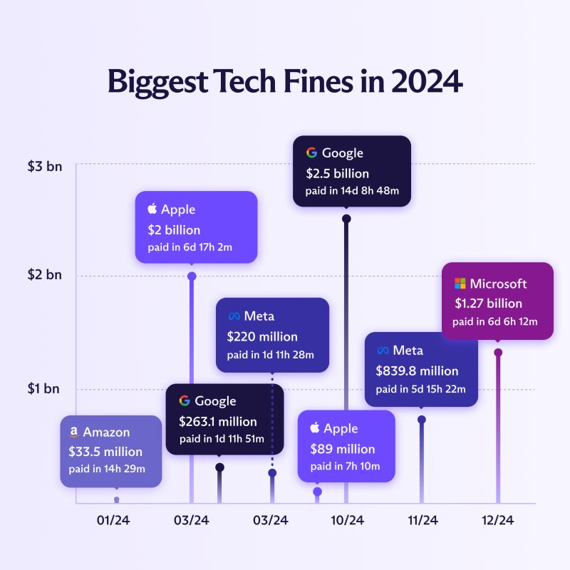
I probably haven't had enough coffee yet, but what exactly is this chart trying to show? And why are MS, Meta, and Apple listed multiple times as opposed to once like they are in the article (once per section)?
It's an incredibly bad chart mostly for the x-axis being so horrible in scale that March, when a lot of fines were handed out, had to be repeated twice.
What we are seeing are specific fines that were handed out. Like the Apple $2B fine is from the EU for antitrust law violation that was handed to them in March. The $89M fine was handed out by the US Consumer Financial Protection Bureau (CFPB) in October over the whole Apple Card thing and how bank disputes weren't being handled and how Goldman Sachs who backed the card wasn't keeping all of the required compliance information (which I'm shocked at how quickly everyone forgot about it).
I digress.
Yeah, this chart is incredibly bad at indicating this information and by breaking out by violation over time really takes away from the point that ought to be expressed.
Yup, the x axis might as well not exist
A date on each bubble might have been better
The article aggregated all the fines per company (though a breakdown is available at the bottom of the article). The image shows the top 8 biggest individual fines, and the companies you listed had multiple fines in the top 8.
It shows the biggest fines imposed to each company and the month they were paid in. At the end of the article there's a list with different individual fines of each company, with the ammount fined as well as the reason and a link to a relevant article. They just took the biggest numbers for this chart. Hope this helps, and correct me if I'm wrong :)