this post was submitted on 15 Jan 2025
762 points (91.2% liked)
Fediverse
30465 readers
2344 users here now
A community to talk about the Fediverse and all it's related services using ActivityPub (Mastodon, Lemmy, KBin, etc).
If you wanted to get help with moderating your own community then head over to [email protected]!
Rules
- Posts must be on topic.
- Be respectful of others.
- Cite the sources used for graphs and other statistics.
- Follow the general Lemmy.world rules.
Learn more at these websites: Join The Fediverse Wiki, Fediverse.info, Wikipedia Page, The Federation Info (Stats), FediDB (Stats), Sub Rehab (Reddit Migration)
founded 2 years ago
MODERATORS
you are viewing a single comment's thread
view the rest of the comments
view the rest of the comments

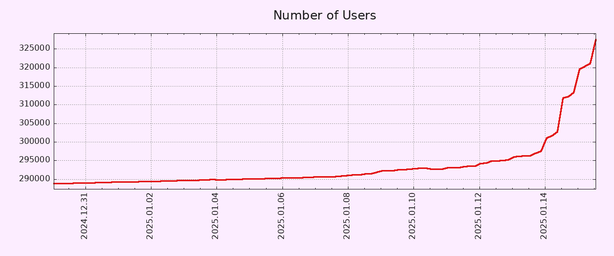
The primary reason I am getting hostile is because there is a chorus of dumbasses who think they're being clever by pointing out that graphs look different when you view them on different time scales. No shit Sherlock. It doesn't negate the fact that this is probably the most significant increase in users the app has ever seen, which is really all my post is saying. On the graph, the line is vertical. Even zooming out 4 months, it's still vertical. Maybe zooming out further will make it less vertical, but that is beside the point. It's still growing fast. Even on your graph you can see the shift. Getting called a liar and having people try to minimize a significant trend is not something I will just let slide off my back. Keep arguing all you want, you're wasting your time.
Ah, so you don't actually understand why you're being called out. It isn't the timescale that "the dumbasses" are calling you out on. It's the Y-axis.
If you cut off the bottom, you can make any graph look vertical. Still, it's not insignificant and it's definitely a turn which is cool, but this is why people are upset at your post title.
The problem is less about the chart and the fact that you are taking a jump from a very short interval and trying to pass it off as something completely unprecedented.
"Lies, damn lies and statistics" is not about calling you a liar, but how people can selectively use different data points to present information that supports their thesis or confirms their biases. I wasn't calling you a liar, I am just disagreeing with you about this being "significant".
If this growth rate holds for the next two weeks, then I'll gladly change my tune and start talking about a trend. But so emphatically making projections out of one or two data points is a fool's errand.