this post was submitted on 02 Dec 2024
563 points (96.5% liked)
Funny: Home of the Haha
6545 readers
78 users here now
Welcome to /c/funny, a place for all your humorous and amusing content.
Looking for mods! Send an application to Stamets!
Our Rules:
-
Keep it civil. We're all people here. Be respectful to one another.
-
No sexism, racism, homophobia, transphobia or any other flavor of bigotry. I should not need to explain this one.
-
Try not to repost anything posted within the past month. Beyond that, go for it. Not everyone is on every site all the time.
Other Communities:
-
/c/[email protected] - Star Trek chat, memes and shitposts
-
/c/[email protected] - General memes
founded 2 years ago
MODERATORS
you are viewing a single comment's thread
view the rest of the comments
view the rest of the comments

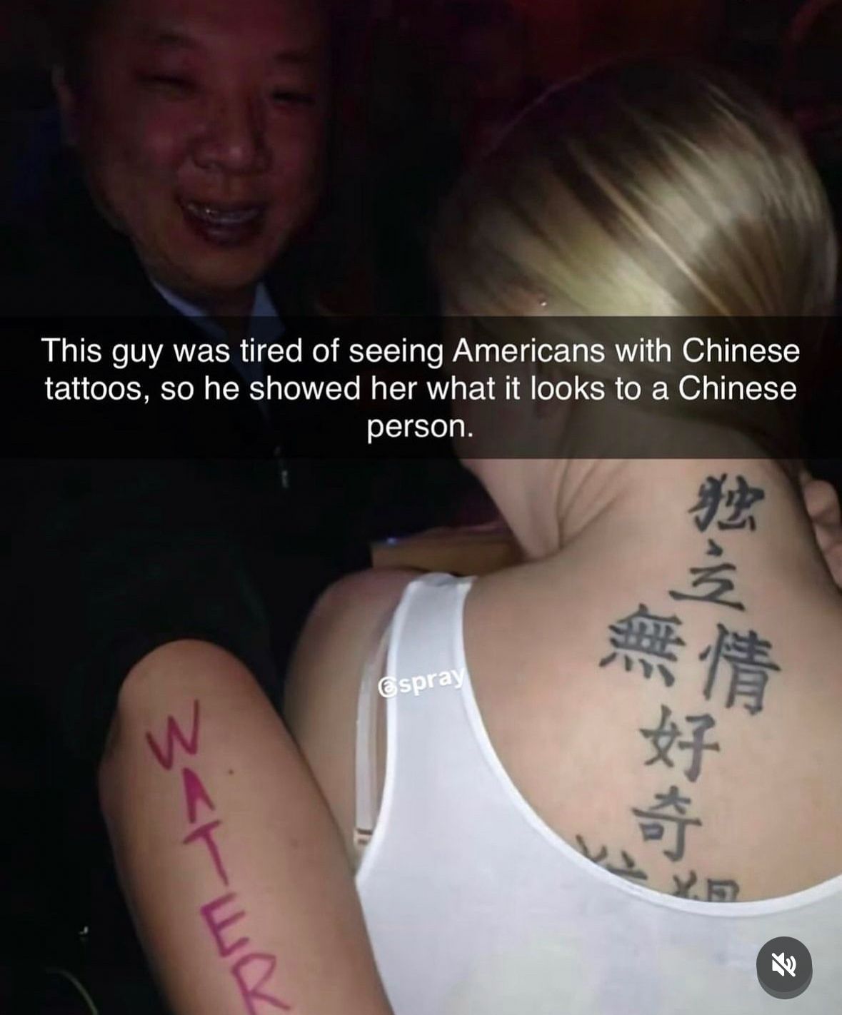
So many Chinese character tattoos are done in the Chinese equivalent of boring Arial 10 font though, that's part of the point. The one in the photo is at least hand written, but by someone with poor aesthetic sense, it still looks dull and ugly.
Is there a fancy old Chinese font? What about wing dings?
There are different Chinese fonts (in print/computer context) and also different Chinese historical scripts, each with different styles of writing, and finally a very diverse variety of calligraphy styles.
The idea of what is considered "old", "fancy" and "fancy old" doesn't necessarily map the same way as it does in Latin/Western writing in general, the cultural and historical sensibility and connotations are often quite different, although in most broad sense, you could find some style analogues to achieve a similar vibe, but it would be quite context dependent.
Thanks for the explanation! Now I want to fuck with people by telling them they used the Chinese version of wing dings.
Chinese characters in “arial” font would be monowidth lines, no serifs, no real pizzaz. The tattoo in the picture is how I see most Chinese character tattoos. This is still stylized a bit.
Sure, but tattoos in sans serif fonts are still super common, and honestly, it makes little difference, the one in OP is still basic as fuck - call it Times New Roman instead of Arial. It reads like plain text to a Chinese reader, not some kind of calligraphy - what you call "stylized" is actually just the default original textbook stroke style of the standard script. The sans serif version with monowidth lines is actually more of a modern stylized form of that.
The one in the photo is probably still a font. How many tattoo artists would know how to write in Chinese calligraphy.
To me it looks done by hand, the inconsistencies in character sizes and stroke widths wouldn't be seen in an actual font. The 独 also looks very hand drawn, the vertical strokes on 無 as well. It's very "textbook" calligraphy, done by someone who knows the strokes and has some practice, but dull and with no personality, and still a degree of insecurity and inconsistency in the strokes, so perhaps a late beginner to intermediate level student of calligraphy. Not necessarily by the tattoo artist either, it could have been tattooed from a template written on paper.