this post was submitted on 02 Dec 2024
563 points (96.5% liked)
Funny: Home of the Haha
6545 readers
78 users here now
Welcome to /c/funny, a place for all your humorous and amusing content.
Looking for mods! Send an application to Stamets!
Our Rules:
-
Keep it civil. We're all people here. Be respectful to one another.
-
No sexism, racism, homophobia, transphobia or any other flavor of bigotry. I should not need to explain this one.
-
Try not to repost anything posted within the past month. Beyond that, go for it. Not everyone is on every site all the time.
Other Communities:
-
/c/[email protected] - Star Trek chat, memes and shitposts
-
/c/[email protected] - General memes
founded 2 years ago
MODERATORS
you are viewing a single comment's thread
view the rest of the comments
view the rest of the comments

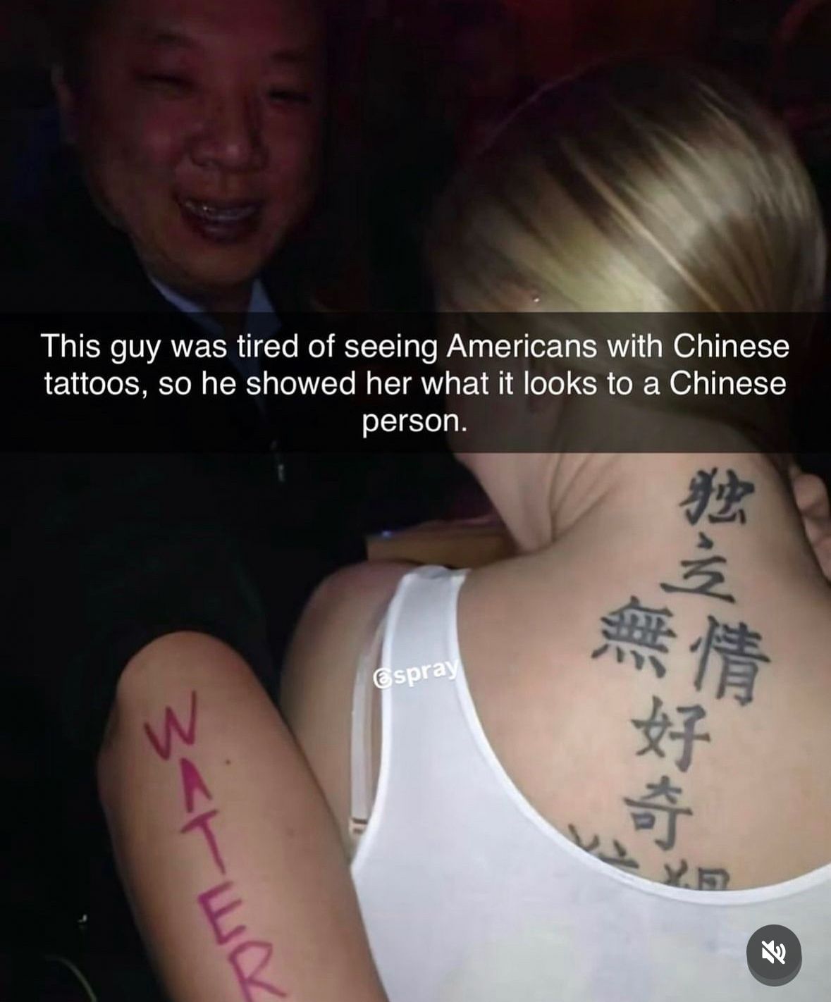
To me it looks done by hand, the inconsistencies in character sizes and stroke widths wouldn't be seen in an actual font. The 独 also looks very hand drawn, the vertical strokes on 無 as well. It's very "textbook" calligraphy, done by someone who knows the strokes and has some practice, but dull and with no personality, and still a degree of insecurity and inconsistency in the strokes, so perhaps a late beginner to intermediate level student of calligraphy. Not necessarily by the tattoo artist either, it could have been tattooed from a template written on paper.