this post was submitted on 24 Nov 2024
1482 points (97.8% liked)
memes
11583 readers
3426 users here now
Community rules
1. Be civil
No trolling, bigotry or other insulting / annoying behaviour
2. No politics
This is non-politics community. For political memes please go to [email protected]
3. No recent reposts
Check for reposts when posting a meme, you can only repost after 1 month
4. No bots
No bots without the express approval of the mods or the admins
5. No Spam/Ads
No advertisements or spam. This is an instance rule and the only way to live.
A collection of some classic Lemmy memes for your enjoyment
Sister communities
- [email protected] : Star Trek memes, chat and shitposts
- [email protected] : Lemmy Shitposts, anything and everything goes.
- [email protected] : Linux themed memes
- [email protected] : for those who love comic stories.
founded 2 years ago
MODERATORS
you are viewing a single comment's thread
view the rest of the comments
view the rest of the comments

Why are you using data from the 2017 report?
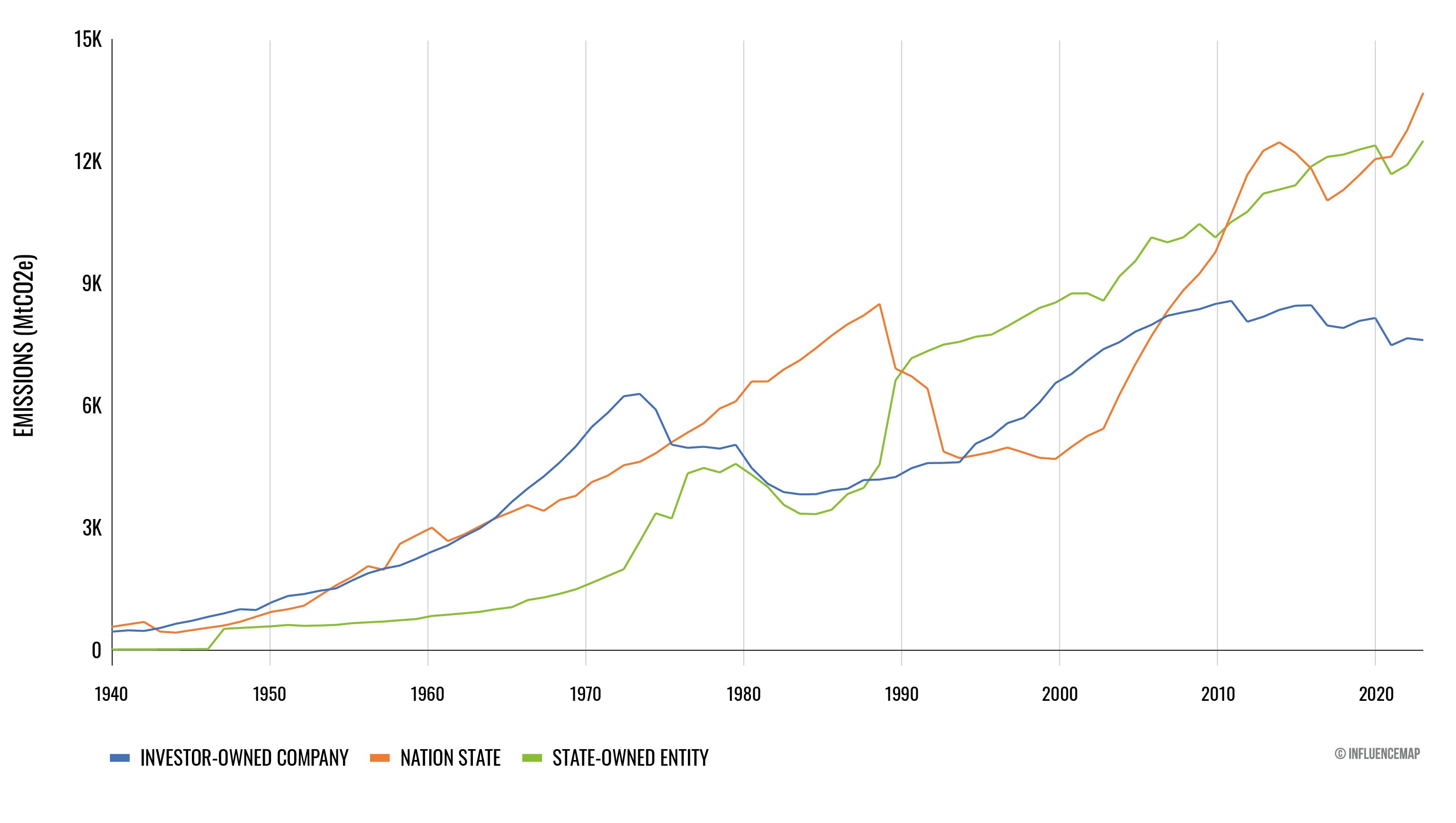
You are referring to page 15, which shows emissions in 2015. In the up to date 2024 report this has been replaced with emissions after the Paris climate agreement, so 2016 till 2022.
As you can see, the same picture emerges as I stated in my first post: the top actors are Nations or state owned producers. The contribution to global Co2 emissions is listet, but still only refers to fossil fuel and cement Co 2 emissions.
Great question! The reason why I was using the 2017 report is that the Guardian arrival you originally referred to was from 2017, so I looked at the report they were working off of. While the article is still misleading (shame Guardian) the notion that a small proportion of companies, both state and private owned (100-200), are responsible for the majority (>50%) of global emissions.
Looking at the updated graph of annual emissions, it seems like this is still true, though I haven't counted the companies. Again I agree the 72% figure is misleading, but I am pushing back on the alternative implication that relatively few companies are not actually making up the majority of annual emissions.
That is sensible, yes.
I regards to the graph you posted, it shows how emissions from private comps is have fallen and emissions from nations and nation owned companies have rissen. I think this is a relevant distinction to make, because the meme and the report as they are show a one sided picture (capitalism is the sole drive of climate change) whilst, looking at the complete data, a more nuanced picture emerges (like the role of nations in upholding the capitals system).