this post was submitted on 15 Nov 2024
293 points (94.0% liked)
Linux
48624 readers
1415 users here now
From Wikipedia, the free encyclopedia
Linux is a family of open source Unix-like operating systems based on the Linux kernel, an operating system kernel first released on September 17, 1991 by Linus Torvalds. Linux is typically packaged in a Linux distribution (or distro for short).
Distributions include the Linux kernel and supporting system software and libraries, many of which are provided by the GNU Project. Many Linux distributions use the word "Linux" in their name, but the Free Software Foundation uses the name GNU/Linux to emphasize the importance of GNU software, causing some controversy.
Rules
- Posts must be relevant to operating systems running the Linux kernel. GNU/Linux or otherwise.
- No misinformation
- No NSFW content
- No hate speech, bigotry, etc
Related Communities
Community icon by Alpár-Etele Méder, licensed under CC BY 3.0
founded 5 years ago
MODERATORS
you are viewing a single comment's thread
view the rest of the comments
view the rest of the comments

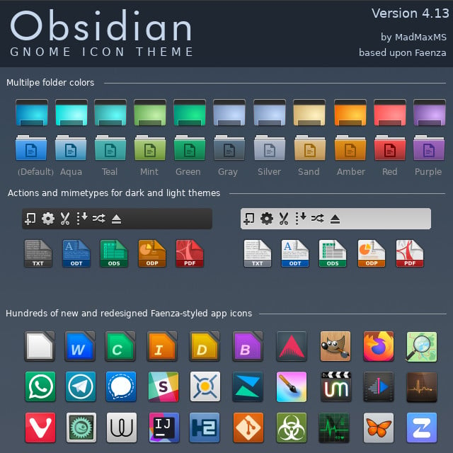
Personally I don't, I kinda hate old skeuomorphism 😅
Neo skeuomorphism has some neat novelty though.
Edit: this is just my personal aesthetic preference, I don't begrudge anyone their love of skeuomorphism, or nostalgia for it.
I think I’m in the same place. I really like the idea of icons having depth. Modern icons are very versatile, but lack personality. Having some depth gives them some weight, but never really liked the emphasis on curves and gradients. I think a mix of original Material design and just a hint more depth would be the perfect sweet spot.
I'm curious how you feel about the GNOME application icons, they sound like they might be up your alley
Right now I generally have a preference for either weird stylized themed stuff I make myself, or very flat stuff like what android currently does for app icons, but I can certainly see the appeal of other stuff :)
I really like the application icons used in Gnome but I really like the consistent line weights and geometry of material symbolic icons so I'm still using a material icon pack on gnome
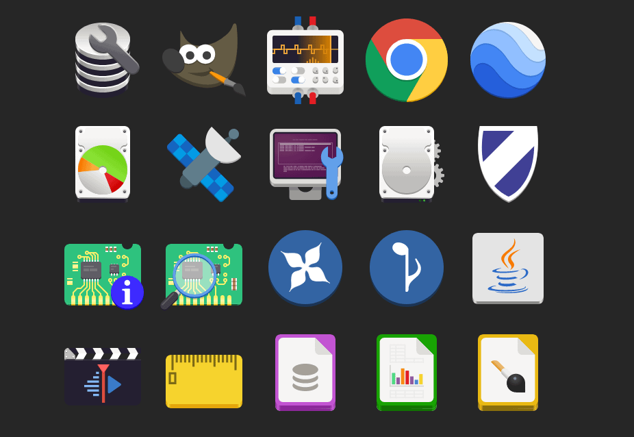
Edit: Here's a picture I grabbed of icons done in the adwaita style Gnome uses in case you don't use linux and aren't familiar with them. Its not a full sampling, but you get the idea :)
Take these icons, add one more layer of simple gradient shading: perfection
For example, GIMP’s icon looks especially bad here to me. If it had just a hint of black shading, it would look massively better (imho).
Interesting, thanks for sharing your perspective with me! ☺️
Any time! I’m a graphic nerd with none of the book learning, but I do work at a screen printing shop, so I have some intuitive understanding of logo/icon design, but don’t have the theory to go with it.
In other words, I have wildly subjective opinions that I’ll randomly dig my heels in on. (Sometimes when I have no idea what I’m talking about ha!)
Lol, I'm somewhat similar. I'm a big ui/ux nerd but don't have professional or academic experience other than some pro-bono work in high-school. But I love tinkering with my phone's homesceen and other similar little projects. I'm hoping to make a neocites page soon!
This is my previous phone's homescreen I posted a while back:
https://mastodon.online/@CrisColor/111440259435482295
I've gotten a new phone since then and am still getting it updated to fit properly on a new screen, so right now it looks a little jank 😅 but it's always interesting to hear how other people feel differently about aesthetics than yourself!
Right on. I’ve moved onto a dirty iPhone since, but here’s a screenshot of my super old Android setup back from when Material was new. After Android took out all the fun stuff custom ROMs could do, I sort of fell out of love with Android.
I had a cool feature at one point where it started out looking like this and unlocking it would make the circle expand and the background would show in full.
Man, I miss early KLWP
That looks awesome! I'm deeply nostalgic for that period of time, material design was the big thing when I was first getting into UI design and I was absolutely in love with it
Klwp and Kwgt are still a blast, that's what almost all of my stuff is made out of, but iOS has its pros as well :) from what I hear things are progressively getting a little more customizable, if still pretty locked down
At some point I'd like to get a little better at animations so I can make my setup feel a little more alive, but for the time being it's mostly just static elements