- slide1: Sales within the US by category (image attached, hover on slice show sales number)
- slide2: Average amount spent on cats & dogs in past 12 month
- slide3: Pet ownership, household count
- slide4: Pet ownership by generation
- slide5: Petco quarterly revenue by category
link to data slides
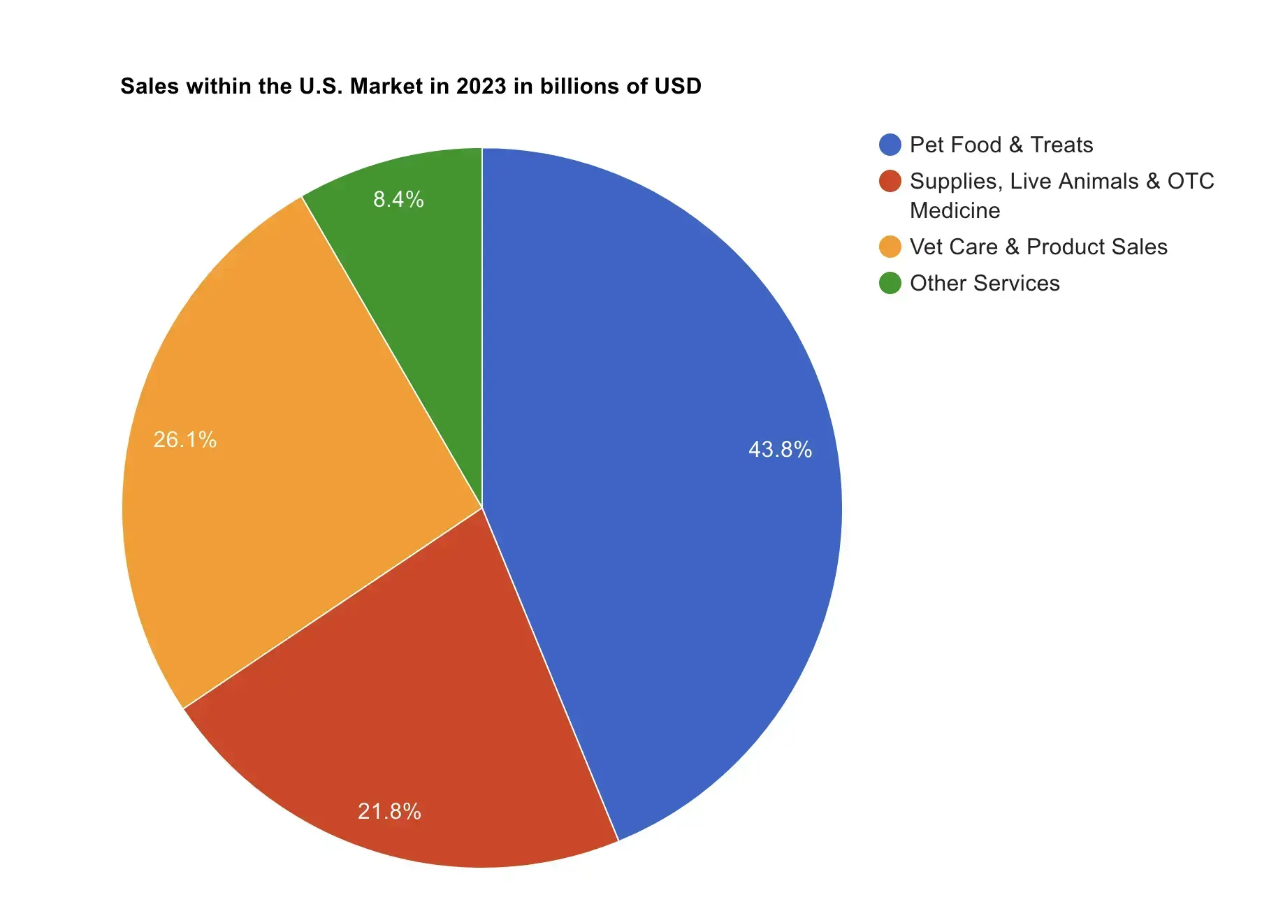
Billions? On a percentage graph?
No useful data to be found here.
yes, it show percentage, for actual sales data, click the link and hover on the slice with laptop. mobile / phone may not work
The graph might be half valid if it didn't state 'billions' in a totally ambiguous way without a roughly exact number for scale.
But nope, no solid number for scale.
You are correct though, you can't hover over the graph with mobile devices. Which, I should point out, a majority of people are using these days.