UXDesign

252 readers
1 users here now

Everything about UX design

founded 1 year ago
MODERATORS
1


In the discovery phase of a UX project, a problem statement is used to identify and frame the problem to be explored and solved, as well as to communicate the discovery’s scope and focus.

2


Not sure I entirely agree with the article but there is a good point in there about understanding the constraints that development is bound by. But it takes a lot for designers to become proficient enough to do what they need in code, just as the opposite is true with developers doing design.

3
1
Changin roles from UX (self.uxdesign)
submitted 1 year ago by PixelatedSaturn to c/uxdesign


I've been doing UX and UI for many years. I just returned to it two years ago, having been an art director for about 10 years in between.

Its been really exciting for these two years and I'm even coming up to some new interesting projects, but a lot of times I'm really not feeling it. I think it's probably also because I'm alone in a small team. The team is great, ultra supportive, great bunch of people. Still, often I feel like my talents should be in programming somewhere. But definitely not web development. I've done that in the beginning of my career and I never want to do it again. I think that currently UX is best positioned to be one of tyne most important professions in the digital space. Our tools will evolve closer and closer to the actual apps and we will need less and less engineers between prototypes and final apps. Why would I want to be a programmer? I just have this jearning of writing stuff down in a code and that it works exactly like I want to. Design is flimsy by nature. It's not mathematics.

Its a weird feeling I often get. I like ux. I'll for sure stay longer and see where it goes.

4
3
Web Design Museum (www.webdesignmuseum.org)
submitted 1 year ago by PixelatedSaturn to c/uxdesign


Incredible the designs we already had. The technologies we went through and abandoned.

5


From the launch of Dev Mode, a new space for developers, to the introduction of variables for best practices adaptable designs, advanced prototyping features, auto layout updates, an improved font picker, and a redesigned file browser, Figma is revolutionizing the design and development process. Whether you’re a beginner or a senior UX/UI designer, discover how these updates can enhance your design workflow.

6


cross-posted from: https://lemmy.world/post/456193

I'm working on a website (https://www.go2lemmy.com), which, with just a few clicks, would allow a user to automatically modify all their old comments & posts on reddit to be ads for lemmy. It's using oauth. Anyways, the backend code is pretty much finished, I just suck ass at design, so if anyone wants to work on it with me, you can add me on Discord: indictevolution

Should only take an hour or two I imagine for the design, not much to the site at all.

7


I was waiting for this tool to come out. Didn't really know what to expect, but looking at this video it seems pretty much useless. I don't understand in what situation I would use it? Joking around before starting a project, maybe for some feature inspiration?

8


Is Lemmys grey off-putting for you? Its really really grey. In the way something devoid of color is grey, not a cool grey that makes you think of a spaceship just before it fires a bright neon color laser.

I know I know, its like basic, rugged, kind of gives of the vibe that time was spent for more important things than that. And yeah, sure, there is that daylight option, but seriously, how many people don't use dark mode.

9
16
UX for Jerboa (lemmy.world)
submitted 1 year ago by PixelatedSaturn to c/uxdesign


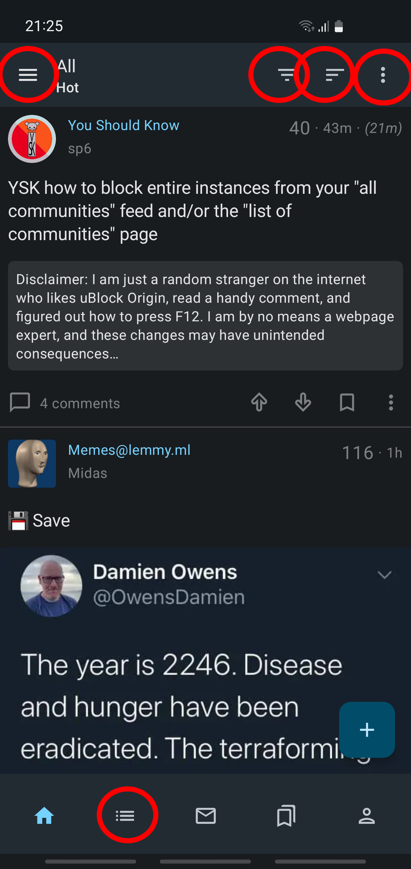
Lemmy is new (newish? I dont know I just got here). There are tons of stuff that could be done better. Currently the only android app for Lemmy on the play store Jerboa, that I use, has its growing pains. UX wise this one is the worst (excluding stability issues). I think that the right tripple dot menu is not needed and options there can be integrated to the hamburger menu on the left. The menu for choosing between all-local-subscribed should be a side swipe. We are only left with the icon for sorting which should look less similar to the hamburger menu. On the bottom I literally dont know what the house icon does. The bottom hamburger menu is sort of the same as the top one? Maybe merge these two into the bottom one. The bookmark function has way too big importance for what it is. Who bookmarks stuff in an app like this anyway?

Like this we would incredibly simplify the interface while making it more intuitive and faster to use.

What do you think?

10
6
Lemmy UX (self.uxdesign)
submitted 1 year ago by PixelatedSaturn to c/uxdesign


This has to be a perfect project for anyone looking to improve their portfolio.

11


It is. Especially here on Lemmy