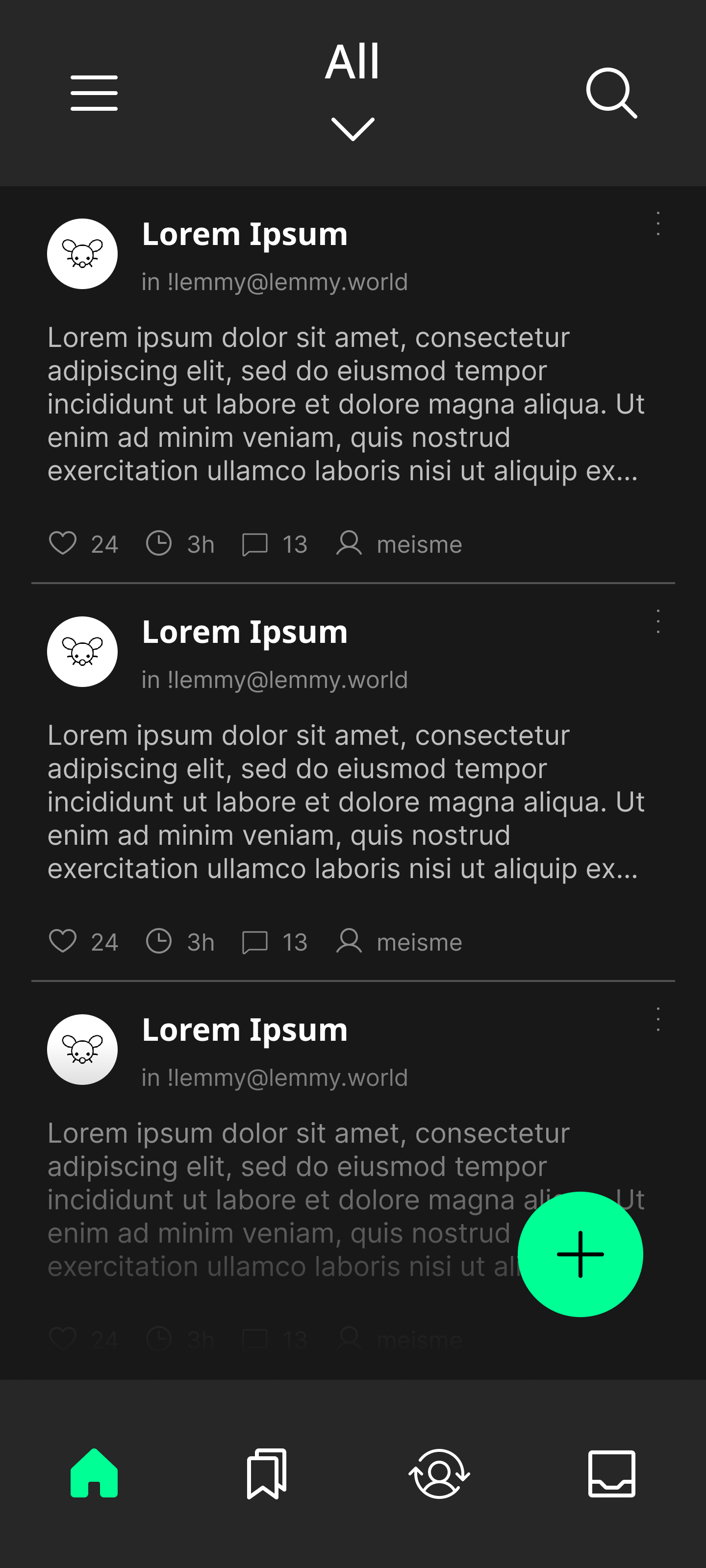
How did you create this? I personally think the UI is taking up too much screen, icons seem a bit large. Not sure how I feel about a big "plus" just hanging around there either
this post was submitted on 02 Jul 2023
2 points (100.0% liked)
Slemm for Lemmy
42 readers
3 users here now
A community for testing and discussing Slemm - an up-and-coming Lemmy app!
founded 2 years ago
MODERATORS
I created it with Figma. It's not real code yet which is why I'm asking for feedback before starting the UI. I will see if adjusting the padding makes it look better, thank you :)
Looks good Maybe if you long press the items it tells you what they do. Ie, If you long press the bookmark it has a little pop up saying bookmark page, same for like button etc. Then a quick tutorial saying long press for details and explaining the upvote/swipe method. Toggle in settings to turn on tutorial one time on app restart (auto off after seeing it once)
I am planning on having a welcome page or a tutorial for the swipe actions. Thank you for the feedback!
