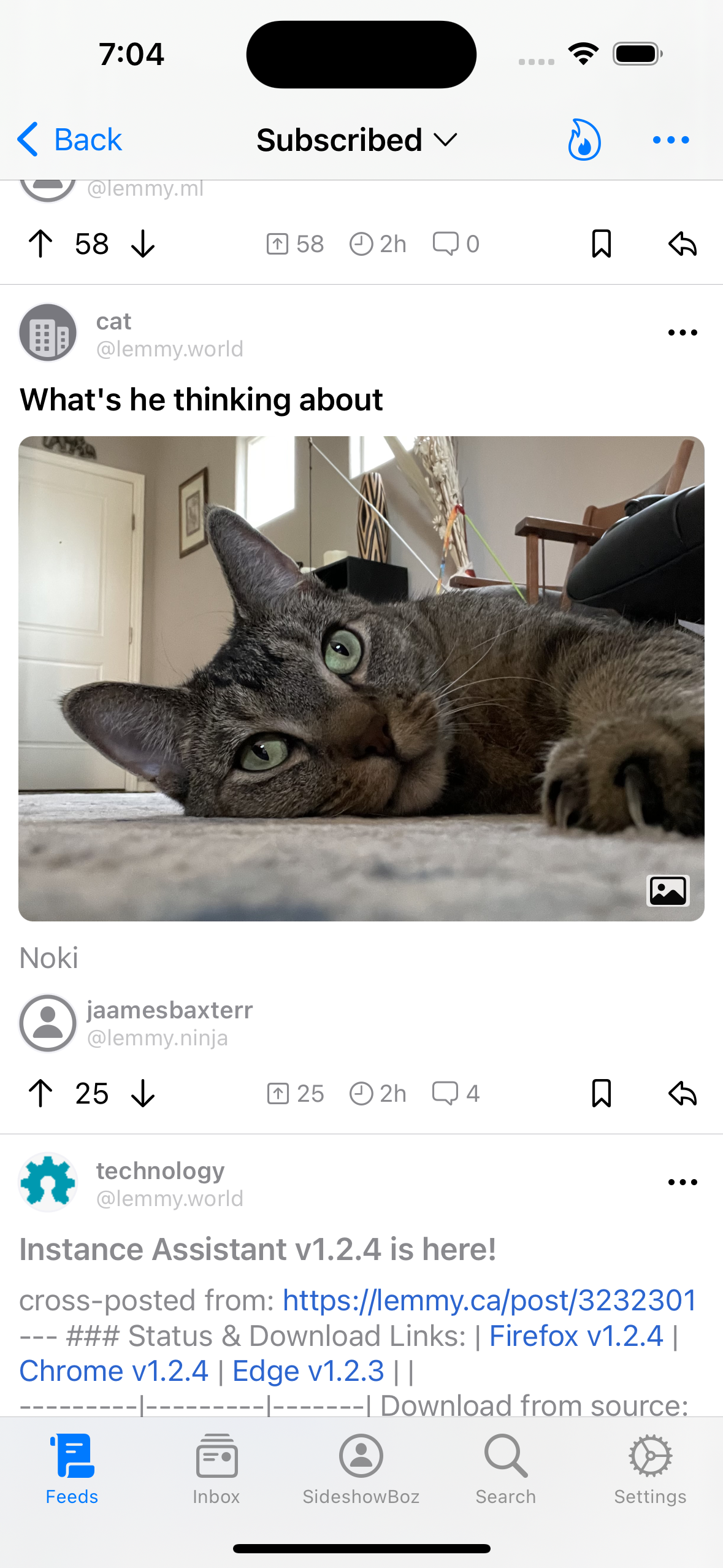
I think displaying icons would be more of a crutch than a solution, different things should look different, without the need for an explicit "label".
Regarding tapping the images, there‘s probably going to be an option to have them expanded in the feed and shrunken by default (instead of being cut off), which might help with that confusion a bit.

