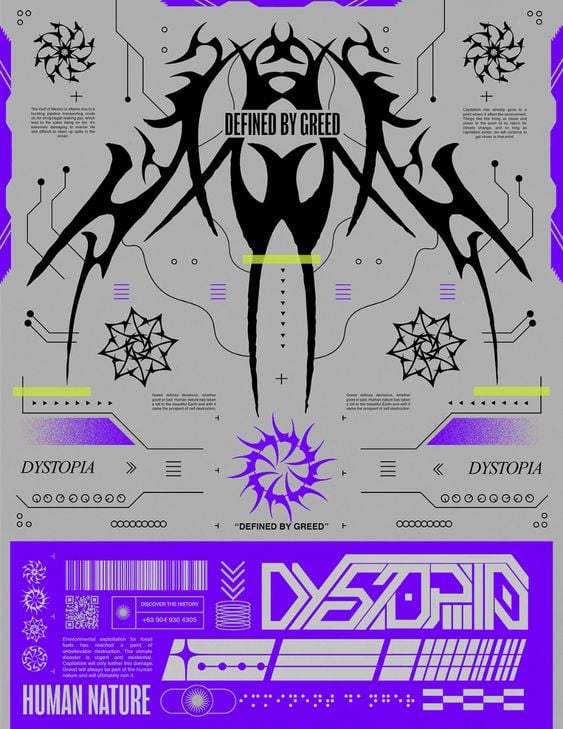
I'm not sure if there's ever a standardized name for colour palettes like there is for specific colours (IK Blue for example). This poster uses complementary colours (purple and yellow being on opposite ends of a colour wheel). Most of the posters I'm seeing on the Behance project are monochromatic with a grey background. You'll find more of the same style by looking for "acidgraphix", which is the current hip design aesthetic on social media.
this post was submitted on 10 Aug 2023
9 points (90.9% liked)
Graphic Design
262 readers
1 users here now
All things graphic design!
founded 2 years ago
MODERATORS
Thanks for your answer :) Acid graphics do quite look interesting
