This is a pretty big release with a large number of UI changes.
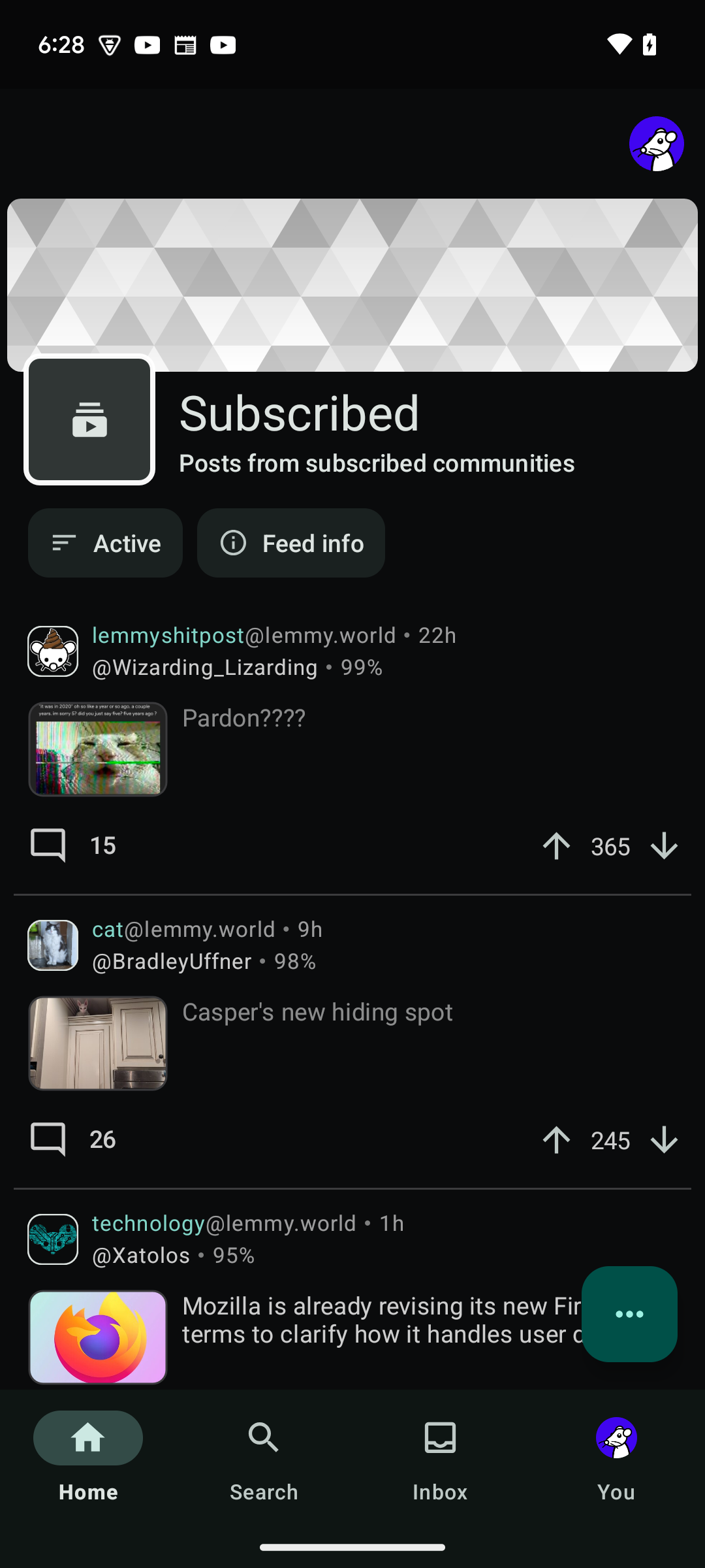
This release adds a lot of user requested features to the app, the biggest one being the post feed header. The post feed header adds some information about the feed to the top of the page. The post feed header is disabled by default and will need to be enabled.
This release also updated the designs of a lot of key UI elements. To be honest I've spent so much time working on the UI that I can no longer tell if it's better or worse than before. User feedback on the new UI is greatly appreciated.
Full changelog
- Add a setting to disable auto-linking IP addresses. Note that auto-linking IP addresses comes free with Android so enabling this feature will actually cause the app to strip them which is a bit slower.
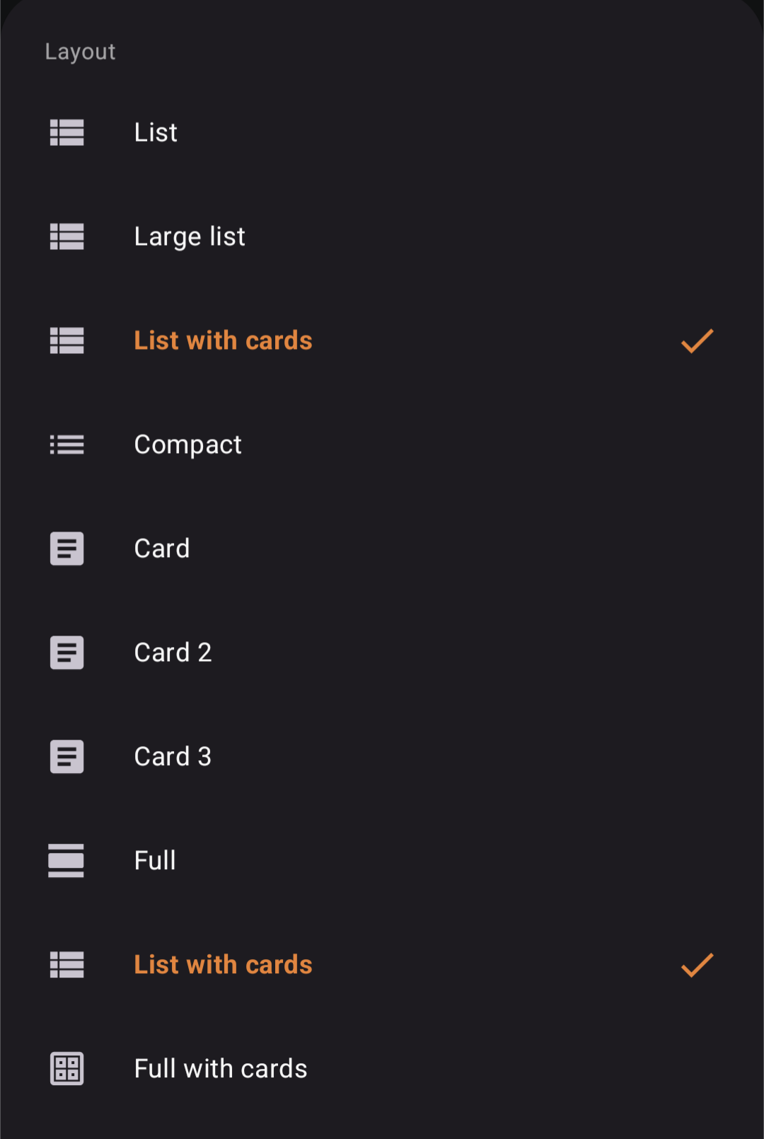
- Add a new layout: full with cards. This layout is the full layout but each post is contained within a card instead of full bleed.
- Add video caching.
- Add new post feed header. This is disabled by default and can be configured in Settings > Posts feed > Use posts feed header.
- Change the UI for the post feed toolbar.
- Change video volume logic to be smarter.
- Change the left side panel to have subscribed communities sorted by name.
- Change icons around the app from circles to rounded squares.
- Change some icon designs.
- Fixed a bug where sometimes expanding the context in the message screen would cause weird behavior.
- Fix locales being mixed together. (Attempt number 2)
- Fix a bug where inline video players are not destroyed properly leading to wasted resources.
- Fix a bug where cache directories are not cleaned up properly.
- Fix a bug where vote colors are not updated immediately in some places.
- Fix some minor UI bugs in the post feed.
- Show an error icon if an image fails to load.
- Adjust left side panel UI.
- Adjust compact layout, card1 layout, card2 layout, full layout, full with cards layout.
- Adjust comment header layout.
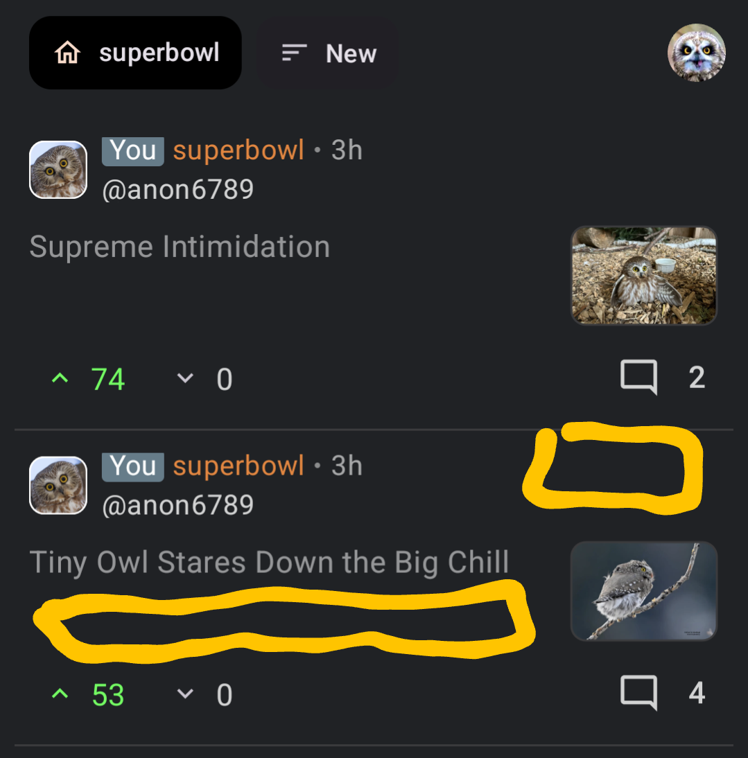
- Fix a bug where when a post with an image is expanded while using the list with cards layout the post would have too much padding.
- Fix a bug where a video in full screen would continue to play even if the screen is closed.
- Fix crash when all subscribed feed is open when feed headers are enabled.
- Initial color picker changes. Changes are bit rough around the edges, will polish in the next release.
- Fix bug where feed headers are blank for certain types of feeds.
Update
User reported some UI issues with certain layouts. Will fix and rerelease as v1.55.1
- Fix a bug where some layouts would show an empty image for text only posts.
Update 2
Some more user reported bugs. Fixing and re-releasing at v1.55.2
- Fix a bug where some preferences were being ignored or was broken.
- Fix a bug where disabling community icons would require the user to leave the app and come back for the change to be applied.
- Fix a bug where the layout "List with cards" option was shown twice.
- Minor UI touch ups.
Update 3
I am not releasing this version to the masses just yet because of all of the UI and internal/under-the-hood changes. I'm going to give all the changes some time to sit first.
I don't have an ETA for the release yet but it should definitely be fully live by the weekend.
Thank you to all the early adopters for helping test the changes.
Update 4
I think I'm done with letting things sit and I have a much better idea of what I want the UI to be like. I will do a hopefully final minor release. Changes are:
- Show an error icon if an image fails to load.
- Adjust left side panel UI.
- Adjust compact layout, card1 layout, card2 layout, full layout, full with cards layout.
- Adjust comment header layout.
- Fix a bug where when a post with an image is expanded while using the list with cards layout the post would have too much padding.
- Fix a bug where a video in full screen would continue to play even if the screen is closed.
Update 5
Found more bugs. Addressing before release to all.
- Fix a bug where some inline images are really small.
- Hide the "All subscribed" feed if user is only signed into one account.
- Make the description in the feed toolbar expandable.
Update 6
Rollout complete.
Update 7
User reported a pretty bad crash when all subscribed feed is selected. Will issue an emergency release for this (v1.55.5). I was in the middle of working on some substantial changes so this release will also include those:
- Fix crash when all subscribed feed is open when feed headers are enabled.
- Initial color picker changes. Changes are bit rough around the edges, will polish in the next release.
- Fix bug where feed headers are blank for certain types of feeds.