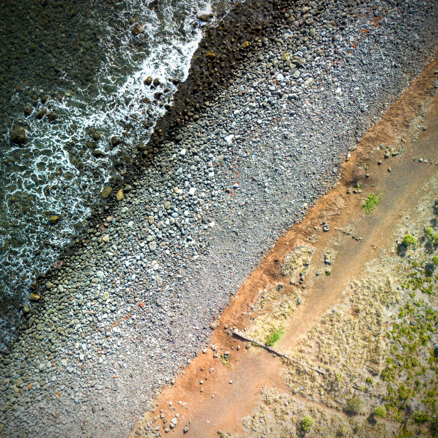
I like this a lot. Though I do think the "human" elements do detract from the desired effect a bit. Without them it's more "abstract" and just leaves the lines, colors and textures which are fantastic.
Beautiful shot!
c/photography is a community centered on the practice of amateur and professional photography. You can come here to discuss the gear, the technique and the culture related to the art of photography. You can also share your work, appreciate the others' and constructively critique each others work.
Please, be sure to read the rules before posting.
THE RULES
This Lemmy Community is open to civil, friendly discussion about our common interest, photography. Excessively rude, mean, unfriendly, or hostile conduct is not permitted.
All discussion threads must be photography related such as latest gear or art news, gear acquisition advices, photography related questions, etc...
This Lemmy Community is about photography and discussion around photography, not religion or politics.
All is in the title. This is a casual discussion community.
One post, one photo in the limit of 3 pictures in a 24 hours timespan. Do not flood the community with your pictures. Be patient, select your best work, and enjoy.
If you want contructive critiques, use [Critique Wanted] in your title.
Flair NSFW posts (nudity, gore, ...)
Do not share your portfolio (instagram, flickr, or else...)
The aim of this community is to invite everyone to discuss around your photography. If you drop everything with one link, this become pointless. Portfolio posts will be deleted. You can however share your portfolio link in the comment section if another member wants to see more of your work.
I like this a lot. Though I do think the "human" elements do detract from the desired effect a bit. Without them it's more "abstract" and just leaves the lines, colors and textures which are fantastic.
Beautiful shot!
I took your comment and Obi's, and combined them in the edited version below Obi's comment.
Thanks so much for the constructive feedback and the praise!
Sure thing - it's an excellent composition regardless of my nitpicking. I've struggled a bit with drone photography and this has given me ideas!
I took your comment and Obi's, and combined them in the editing d version below Obi's comment.
Thanks so much for the constructive feedback and the praise!
I took your comment and Obi's, and combined them in the editing d version below Obi's comment.
Thanks so much for the constructive feedback and the praise!
Might be more visually appealing if the lines went from one corner to the opposite.
Speaking of lines, you have some strong leading lines here that could be used to highlight something: With a composition like this, it's good to be patient and wait until you have a subject in place that lines up with everything. If you're the type of photographer that only takes natural shots and never sets anything up/poses subjects, it can take a while to get this, but it can be worth the wait if you ask me (plus, the more you do it, the better you get at finding the places and moments that make for great photography).
Overall, I like the shot and hope you'll keep taking pictures!
Thanks for the elaborate feedback, it is highly appreciated. You're definitely right about the lines getting more appeal if they went directly from one corner to the other. I'm not sure whether I understand your comment about the subject lining up everything yet. I'd totally get it if the lines were leading somewhere, but struggle to lead anywhere with them being all parallel... I'll ponder it some more and will try different approaches to the topic of a subject when I'm out taking photos the next time, thank you so much!
Not a photographer here. Just here to say: Niiice
Thank you :)
I'd clone out the "subjects", I'd also give this a little bit of extra pop (vibrance etc) but add a strong, very soft vignette.
 Like this?
Very nice! I love the colours and the textures in this shot with the strong lines.
 Like this?
I like it, but my eye is drawn to the center of the image, and it kinda looks like a pile of rubbish. I'd lose this subject (and clone yourself out) because it isn't really recognisable and play with the crop to make those lines work a bit harder. At the moment they're not really doing much. Square crop might work well if you don't have a wider shot to give you more flexibility.