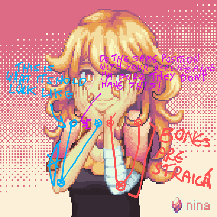
Lighting's great, colour's great, everything's great. But those arms man, they scare me. I would suggest sketching her body first, then do the rest, her anathomy is a tad bit messed up
Pixel Art - pushing pretty pixels around
This shall be the community where we discuss, share, make and learn from each other how to draw the little pictures and game assets we all love.
Rules
-
To make it easy to identify original content, mark original content with [OC] in the post title.
-
If it is not your art, please credit the creator out of respect for their efforts.
-
Critizise art in a constructive manner and only when asked for.
-
Consider adding a copyright license hint to your post, if you are fine with people sharing your work.
-
This community is about enjoying art and appreciating artists, please do not post generated images here
Resources
What about the scares you?
They look strange, thats what i mean
What about them looks weird?
Their anathomy
What part of the anatomy? If you know something is off, why can you not point it out? I see nothing wrong with the arms, I'd like help in knowing what is wrong.

1st(in red): bones are straingt
2nd(im blue): this is what it should look like
3rd(in purple): do the same position with your real life arms, i am sure they don't have this.
To be clear, in the third i'm refeering to the straing part the arrow points at
You do know that arms are more than 2 static sticks with a hinge right?
Yes, i know, but my point is that bones do not bend like that, still like your drawing two
Sweet! Good job!
