this post was submitted on 09 Jul 2023
129 points (99.2% liked)

Connect for Lemmy App

2661 readers
1 users here now

A community for the mobile app Connect for Lemmy.

Links

founded 1 year ago
MODERATORS
 

Hi, only bug fixes in this release as the feature I'm working on isn't quite ready yet and I had to set up a local instance of Lemmy for testing purposes without spamming a live instance. Hopefully this means more testing from my side going forward and more app stability. For thumbnails I'm now loading in better compressed images so you should see memory and network improvements, especially on list views where I also scale the thumbnail to the size of the list card, 1MB images are now 10KB in my testing. I changed the upvote colour to more of an orangey colour. It matches the app icon orange now. If you have the setting to open links in a external browser it no longer applies to opening images.

What's new

  • Upvote colour is now orange
  • Thumbnails are now more efficient (especially list views)
  • Images no longer open in external browser
  • Communities will now respect the 'Should Launch Externally' setting on open

Fixes

  • Comment hint text ('Comment') now matches your theme settings
  • Comment textbox is now autofocused so no extra click needed
  • Improved the text visibility of the Notificiation icon number
  • List view images are now aligned to the top and not the center
  • Fixed a minor left padding issue on List view body text
  • Adjusted the text for 'Show Post Bottom bar' to better reflect what it does
  • Fixed a bug with Subscribe/Unsubscribe not showing correct values in the top right action menu
  • Fixed the error message when unable to find a person
  • Fixed copy url action item for web views

Thank you so much for all of your feedback! A bottom nav drawer seems like the most requested feature currently so please look forward to that! It will have an option to disable for those that don't prefer it.

Links:

-kuroneko
top 50 comments
sorted by: hot top controversial new old
[–] [email protected] 6 points 1 year ago* (last edited 1 year ago)

I've been oscillating back and forth between wefwef and Connect and think I'm likely to stick with Connect.

I love all the customization options, they really let me change the UI to the way I was used to with RiF.

One thing I'd ask for is an option for text posts to have a dummy thumbnail so that all submission entries have the title, submitter, community, comment/vote counts in the same place. At the moment posts in the list without a thumbnail look a bit disjointed.

[–] [email protected] 6 points 1 year ago* (last edited 1 year ago) (3 children)

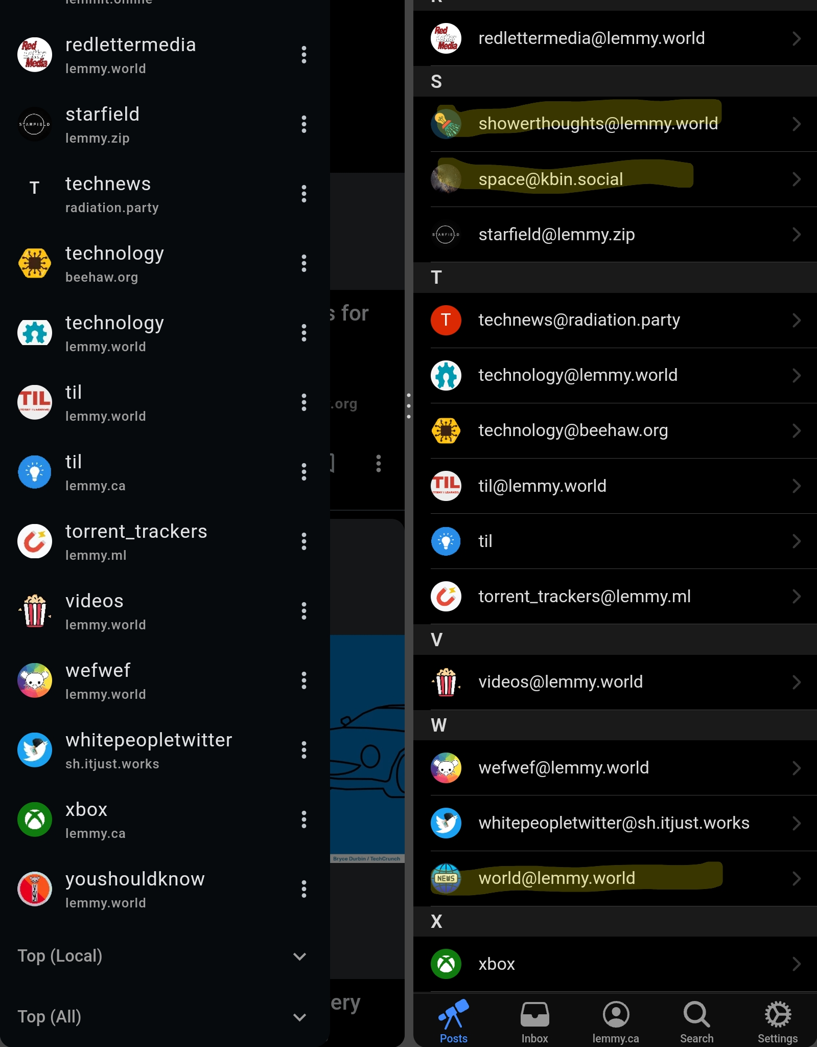
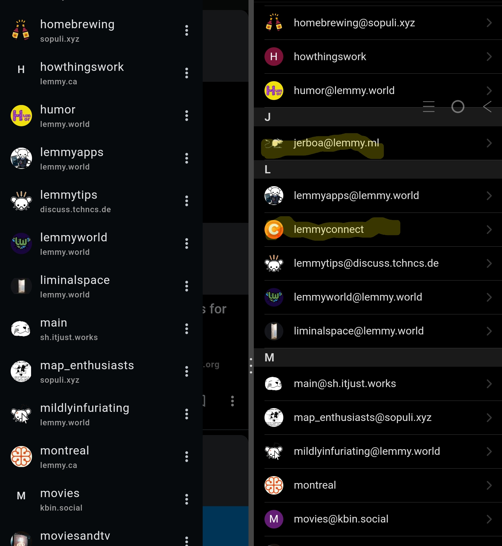
Just so you know I still have this issue where connect won't let me subscribe to some specific communities / some subscribed communities don't appear on my left tab.

I thought that my .ca account was "safe" from this issue but it started happening this morning as well. (Same on .world / sh.j.w)

Fwiw thunder has the same issue, but wefwef works fine. So I sometimes have to resort to the web interface or wefwef to subscribe / view these subs on my subscriptions list

[–] [email protected] 2 points 1 year ago* (last edited 1 year ago) (1 children)

Left: Connect Right: Wefwef. Same account.

The weird thing being that I'm sure that these communities were showing yesterday

[–] [email protected] 1 points 1 year ago (1 children)

I've been having that same problem. I solved it by logging into my desktop and subscribing to communities there. I then signed out of Connect and signed back in and all my new subscriptions were updated.

[–] [email protected] 1 points 1 year ago

I tried, and it never shows up in Connect no matter how.

[–] Blazingflames6073 5 points 1 year ago* (last edited 1 year ago) (1 children)

Your app is now very similar to the third party reddit apps I used to use and I love it.

Could you add another feature to your to do list? It's not really a big priority so I'm okay if it comes very late.

An option for avatars of users to be displayed on their comments.

[–] [email protected] 6 points 1 year ago* (last edited 1 year ago)

Glad you're liking Connect. I'll add that in an upcoming release:)

[–] [email protected] 5 points 1 year ago (1 children)

I was trying a couple of Lemmy apps and hard committed to Connect today! Gotta say, it's the closest thing I've seen to RIF so far!

I didn't want to start a Feature Request thread incase someone has already asked for it, so I'll just ask here. Has anyone asked about getting a link confirmation prompt? It was one of the things I really liked about RIF. When you clicked a hyperlink in a comment, instead of immediately going to the link, a small prompt would come up with the URL and Go/Back buttons. It prevented people hiding malicious or misleading links in a hyperlink. For example, like this: https://i.imgur.com/T9AAccX.jpeg

[–] [email protected] 5 points 1 year ago

That was very useful feature on Rif and I would like to see this on Connect too. Feels like partially blindfolded when I can't see where the hyperlink is pointing at. Also good but a bit rare usecase was to click on prev next buttons when a post or comment had hyperlinks that were too close to each other to accurately click one of them.

Btw, I knew exactly where your hyperlink was pointing at but clicked it anyway :)

[–] Nutbiggums 5 points 1 year ago

App has done a 180 in a couple weeks! Keep up the good work

[–] [email protected] 5 points 1 year ago (1 children)

Hello! I just wanna say that I've been loving your app. You made my Reddit transition painless. Do you have a paypal link for donations? Also, I want to ask...can you make a way to group communities into folders? I've joined so many similar communities that I would like a way to group them together somehow. Reddit would call these "custom feeds" and it's probably the biggest thing I miss right now. Thanx!!

[–] [email protected] 6 points 1 year ago (1 children)

Glad you're liking it! Yeah I'm also missing custom feeds, it should be coming soon :)

[–] [email protected] 3 points 1 year ago (1 children)

That's awesome to hear! Thanx! Also, do you have a paypal link? I'm not comfortable giving my ccard info to buymeacoffee...but I do want to donate!

[–] [email protected] 1 points 1 year ago (1 children)

I don't have PayPal unfortunately

[–] [email protected] 2 points 1 year ago (1 children)

grrr...okay, I'll figure something out!

[–] Falafels 1 points 1 year ago* (last edited 1 year ago)

I haven't used this service myself but I've seen it recommended in the past. Might be something for you to look into. https://privacy.com/

[–] s6original 5 points 1 year ago

All actions are extremely smooth on this release. Very nice. Thank you.

[–] [email protected] 4 points 1 year ago

FYI to anyone with API Issues on this release, your instance admins may have reset authorization credentials (JWT tokens) due to a vulnerability with Lemmy custom emojis. Reinstalling or logging out and back in will fix the issue.

[–] [email protected] 3 points 1 year ago (1 children)

Hi Kuro, could you please address the font size issue as indicated here. It is the biggest thing holding me back from using the app. Thank you!

[–] [email protected] 2 points 1 year ago

Yessir I'll take a look.

[–] [email protected] 3 points 1 year ago (1 children)

I tried to make some requests yesterday but I couldn't find the old thread. Sounds like you addressed my first concern but I'll post them anyway:

~~1. Unsubscribing from communities takes longer because the page takes time to realize I'm subscribed and thus should have an unsubscribe button. Maybe always have an unsubscribe button?~~

  1. Posts and comments I've made should still be visible on my profile even if I've since blocked the community they are in (I had to log in as guest to find this thread even though I've commented in it before, presumably because I accidentally blocked the community?).

  2. If I make a comment, the view should stay on the full-thread view where I was before, not switch to a single comment thread view. As it is now, after commenting, I have to hit back, click the thread again and then scroll down from the top again to find where I left off.

  3. Deleting a comment should be possible from my profile, not require me to navigate the thread it's in to find it.

  4. Theme color picker doesn't allow me to scroll all the way down (maybe my phone is shorter/lower res?).

  5. If I am in a page like blocked list or my profile, and I click search, I'm trying to search within that page's contents, not the homepage.

[–] [email protected] 3 points 1 year ago

Thank you for posting this again! I'll take a look and see what I can do.

[–] [email protected] 2 points 1 year ago

Awesome work. I definitely appreciate the better thumbnails in list view.

[–] [email protected] 2 points 1 year ago (1 children)

I'm sorry about the stupid question, but how does connect compress the images? Is it on a server somewhere that compresses them remotely and sends you the smaller file, as that is the only way I can think of to reduce network usage.

[–] [email protected] 4 points 1 year ago (1 children)

Yeah the pictr service which Lemmy uses has an api (essentially appending parameters to the url) but I'm also reducing the dimensions of images in the disk cache if they exceed a certain threshold.

[–] [email protected] 3 points 1 year ago (1 children)

So I guess that it only works for pictures directly hosted on Lemmy instances? Or does it work with third party image hosts like imgur?

[–] [email protected] 3 points 1 year ago (1 children)

Only the pictures hosted via Lemmy

[–] [email protected] 1 points 1 year ago

That's really cool. Thank you for explaining.

[–] [email protected] 2 points 1 year ago

Hot hot hot 🔥!

[–] [email protected] 2 points 1 year ago* (last edited 1 year ago) (1 children)

I suspect there is a better solution for thumbnails, but not sure if it's you or Lemmy devs who would have to fix it.

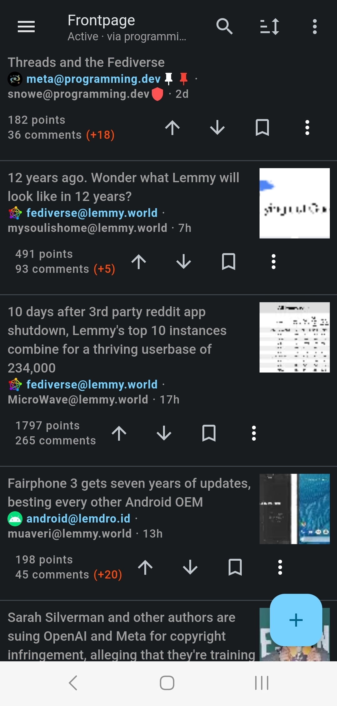
This is how thumbnails look on my device, basically anything with text is completely unreadable:

This image, for example, is 109KB https://lemmy.world/pictrs/image/7fd7eeaa-f466-4697-8ea9-2f16e4372adc.jpeg

This is what Lemmy generates for it at thumbnail=128: https://lemmy.world/pictrs/image/7fd7eeaa-f466-4697-8ea9-2f16e4372adc.jpeg?format=jpg&thumbnail=128

And this is what my local imagemagick makes when asked to resize the original to 128w at 50% quality: https://ibb.co/ZgT35p4

Lemmy image is 4906 bytes and unreadable and the Imagemagick is 1398 bytes and you can make out the text.

And that's before getting into cropping etc. Basically, there's room for improvement, somewhere.

Edit: seems like pict-rs (the library Lemmy uses for image hosting) uses imagemagick to compress images, so it's probably just to do with the selection of filters/options they've chosen.

[–] [email protected] 1 points 1 year ago

Thank you for diving into this. I suspect it's how they're generating the thumbnail as well. Until it changes upstream I've increased the thumbnail size so it gets downscaled locally and is a bit more clear. Not the best solution but better than un-readable thumbnails.

[–] kratoz29 1 points 1 year ago

Great update! Lemmy Connect keep getting better and better!

BTW, some images aren't showing in my feed, particularly thumbnails from webpages, I think this happens more with this app.

[–] [email protected] 1 points 1 year ago* (last edited 1 year ago) (2 children)

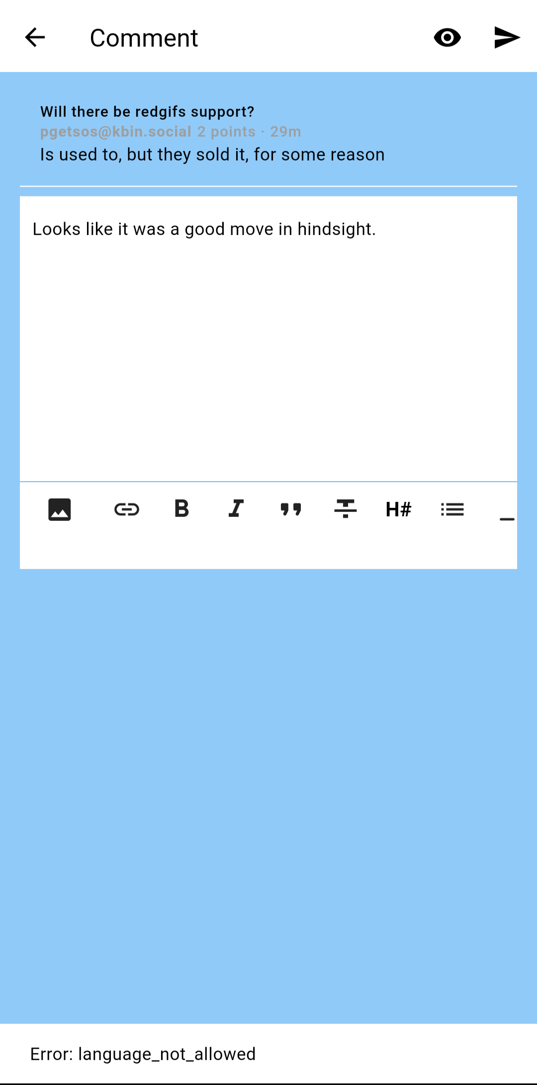
[Bug] Unable to reply to a comment

https://lemmy.ca/comment/1013531

Error: language_not_allowed

[–] Nutbiggums 1 points 1 year ago

Works for me

[–] [email protected] 1 points 1 year ago* (last edited 1 year ago) (1 children)

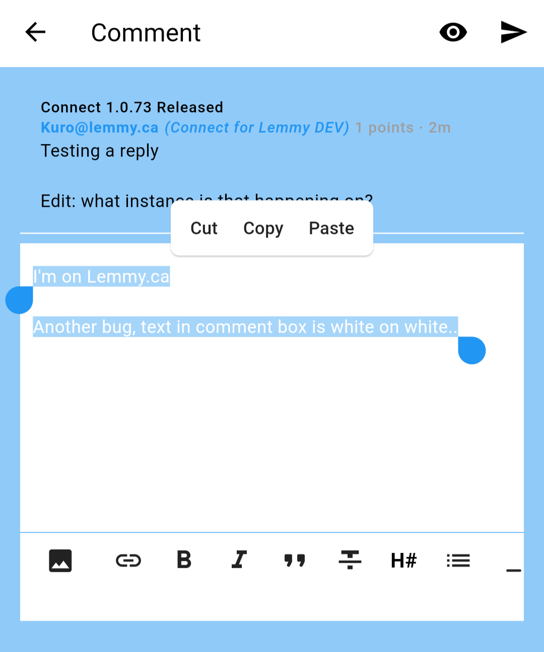
Testing a reply

Edit: what instance is that happening on?

[–] [email protected] 1 points 1 year ago* (last edited 1 year ago) (1 children)

I've reset my theme just in case, same issue.

[–] [email protected] 1 points 1 year ago (1 children)

Is the base theme in settings the light theme?

[–] [email protected] 1 points 1 year ago* (last edited 1 year ago) (1 children)

I'm currently set on System, right now in light mode. Also tried setting to Light mode, same issue. The text is white on gray in dark mode, so that one is fine.

[–] [email protected] 2 points 1 year ago

Ok thanks I'll check it out! I'm using light mode too so very weird.

[–] SwissCheese 1 points 1 year ago

Thanks for the update!

One weird bug, navigating to about instance then view communities, click any community and it opens completely random community.

[–] [email protected] 1 points 1 year ago

I'm not sure but I think upvoted posts add one extra vote for your upvote which is fine when you just upvoted and haven't refreshed the feed yet. But after refreshing the feed those upvoted post's score is always one bigger than when I open the same post in the web app.

[–] amenotef 1 points 1 year ago* (last edited 1 year ago)

Performance is MUCH better now (Reversed List). Maybe it is already "Perfect" but need to keep using the app.

I did some soft scrolling test (lot of light scrolling barely touching the touchscreen) and I couldn't find micro stuttering. (at least not the obvious one!).

I have a doubt: why does "Profile HWUI rendering" (android developer's setting) doesn't show any info when scrolling? Is this because GPU rendering is not used?

Device: Pixel 5

[–] [email protected] 1 points 1 year ago

Thanks for your work, I'm enjoying the app!

[–] Blazingflames6073 1 points 1 year ago* (last edited 1 year ago)

Hello, I'd like to report a bug on this version. Nsfw content isn't blurring.

The content(not actually nsfw)

My settings

[–] [email protected] 1 points 1 year ago
[–] [email protected] 1 points 1 year ago* (last edited 1 year ago)

Thank you so much for adding the horizontal scrolling; the only feature from bacon reader I missed here on Lemmy.

I didn't see it mentioned but after a few posts it kicks me back to the main feed (and not even where I left off when horizontal scrolling)

Also, the mark as read while scrolling didn't seem to mark things as read.

And, not a bug but suggestion. While horizontal scrolling, an obvious post outline to separate the previous and next post would be helpful visually.

Thanks for the great app!

[–] regex1883 1 points 1 year ago

Great job. Fantastic app!

load more comments
view more: next ›