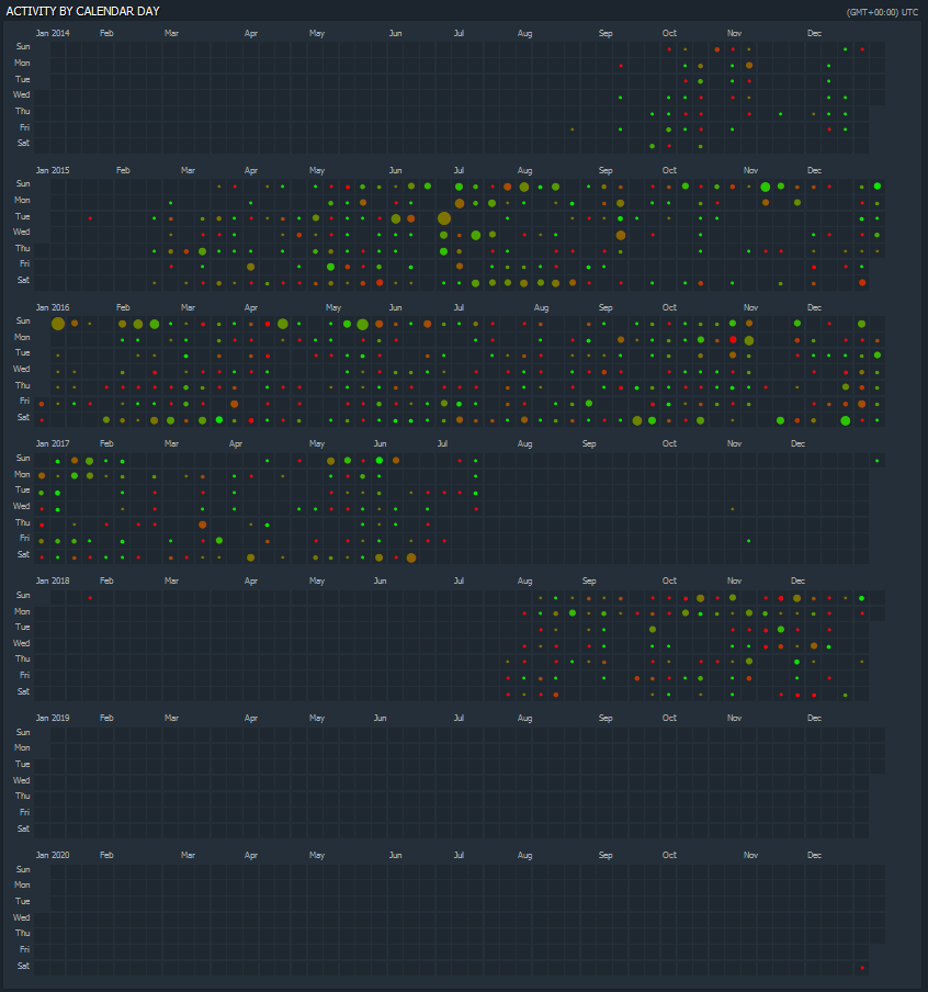
My screenshot of my Dota playtime over the years from Dotabuff.com Size of the circles represents how many games were played that day. Colour of the circles represents the win/loss ratio for that day
A place to share and discuss data visualizations. #dataviz
(under new moderation as of 2024-01, please let me know if there are any changes you want to see!)
My screenshot of my Dota playtime over the years from Dotabuff.com Size of the circles represents how many games were played that day. Colour of the circles represents the win/loss ratio for that day
The sound of hundreds of Dota buff users wishing they’d posted this themselves echoes throughout the fediverse…
haha I didn't even rush to get this out. Just casually strolling through my screenshot folder
i thought this was github