Great work! 😊
/0
Meta community. Discuss about this lemmy instance or lemmy in general.
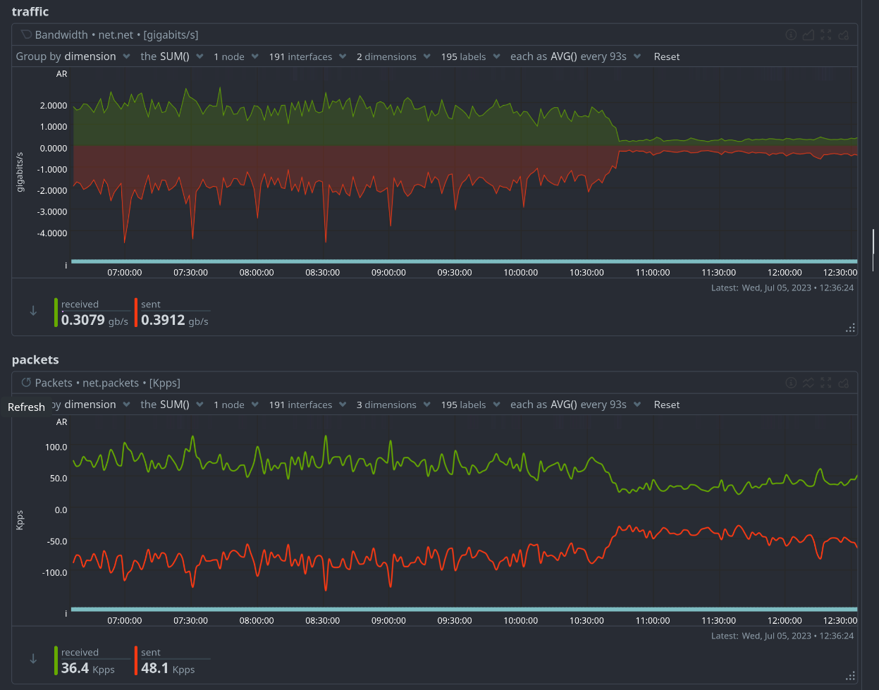
voting and commenting is finally fast too!
I see the layout also changed slightly. I will have to adjust my Stylebot style 😅
What "stylebot style"?
I use the lightly theme and use the Stylebot extension in Firefox to customize it.
Definitely feels faster, nice job! One thing I've noticed the past few days is that the Hot sort is broken, it keeps pulling months old posts to the top which makes it near useless. For now it looks like it's fixed, but it's something to keep an eye on!
Ye, I expect these things to be improved in the next few weeks. I find using the "Top" options more useful myself
The last few days I was mainly using "Top Six Hours" sorting because "Hot" sorting was so broken. But I'm more inclined to post on "Hot" threads because they don't have as many comments yet and my comments don't feel so drowned out.
Top 1 Hour is pretty good at finding relatively new, but not swamped posts imho
Sometimes even years old posts
I came for the shared moral compass, but I stay to see Lemmy as a space marine in a pirate hat continue to get more badass.
Smooth sailin it is, thanks!
Nice!
👏
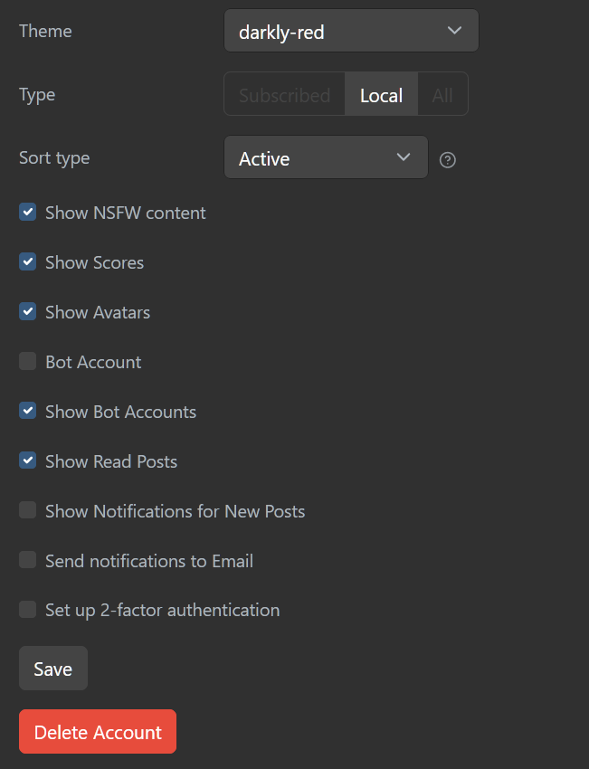
This version is a pleasure to navigate with. My only complain would be that the darkly-red theme is now... blue!
~~By the way, I noticed that this instance's blocklist is now empty, we're linked to previously defederated instances; is it intentional?~~
If you're looking at /instances, the blocklist has just been moved to the bottom.
My only complain would be that the darkly-red theme is now… blue!
not on my end. Are you talking about the background image?
Oh, I read it all wrong then. Sorry 😅
Are you talking about the background image?
No, the accent color; you know, for the links, buttons, comment window border, etc... All of that's been changed from a contrasting red to a too discreet blue.
can you show me a screenshot? because for me it looks fine
(Sorry for the late reply)
It seems to be almost be back to normal, the bulk of the interface has its red color now... I'm not complaining, but I can't make a screenshot now 😅
There are some parts that are still blue or behave weirdly though:


Feels much better now
Woot! :)
Love it! I also love the unique design of this instance. It makes me want to switch to it as my main instance.
Keep up the great work.

