For what i heard, a lot of people on the Linux community use Krita for image manipulation, even though, it's intended for digital painting, and GIMP is the one intended for image manipulation, because people don't like the GIMP's UI.
My issue is, i never understood why they don't like the GIMP's UI, since i never have issues with it,(Although it's probably because i'm used to the UI) so i need to adress this problem and ask you What does the GIMP UI has that you don't like or hate so much and why you like Krita's UI over GIMP's?
Before you event comment your answer i need to ask you to do the following:
-
Address each specific issue along with an concise and direct explanation of why you don't like it
-
Answers such as "I just don't like it", "I don't like where it's placed" or anything alike doesn't count as "Concise and Direct", we are adults, not 4 year old children.
-
If you can provide a suggestion of how GIMP's UI can be improved, it would help a lot, and maybe this issue can be solved.
-
If someone else commented something you were about to comment, upvote them, this way we can address the most common issues effectively.
-
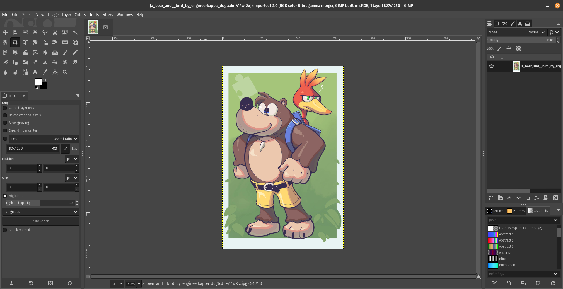
I need you to watch the screenshots of both UI's, because something that most people don't know, it's how similar Krita and GIMP's UIs are.
Krita's UI

GIMP's UI

(Credits to a friend of mine for lettig me use the screenshots.)
My ideas on how GIMP can improve it's UI
-
Adding the option of the new UI selected by default, but with the possibility to switch to the new UI.
-
Possibly addding "work spaces" like Krita would help too, along with the possibility of exporting and importing them, this way people can have custom arrangements of the UI according to the kind of work they will do.
Thanks for reading and hopefully we can address this issue effectively.
It's not what the buttons look like, it's what they do. In Krita, making an ellipse involves clicking the ellipse button and dragging it somewhere. You now have an ellipse, and you hold shift if you want to make it a circle instead.
In GIMP there is no direct ellipse tool, there's only an ellipse select tool, likewise you hold shift to make it a circle. Then you use a menu item to select the border of your selection, getting a popup to let you determine how much pixels you want. And then, you use the fill tool or fill menu item to fill it. That's a surprising amount of clicks to accomplish what's most likely the single most common task for anyone opening a screenshot in an image editor. I'm not aware of any easier/faster method to do it. Feels like it should exist, but this is also what you get if you search for how to draw a circle in GIMP, so if it exists everyone's missing it.
GIMP's method gives you more power, but you rarely ever need that power. But when you do, Krita also has ellipse select, border select and various fill tools that can be strung together in the same way.
Small comment on that: after I discovered greenshot on windows, I have never needed to open the screenshot again to edit it, because it already does all these simple tasks right after taking a screenshot.
Hm, yeah, i never used the Elipse tool, i guess yeah, that should give the advance settings as an option, but going simple should be first, wish we could reach out the devs, but it's not an easy task. :/