this post was submitted on 02 Apr 2024
1145 points (96.7% liked)
Memes
46244 readers
2662 users here now
Rules:
- Be civil and nice.
- Try not to excessively repost, as a rule of thumb, wait at least 2 months to do it if you have to.
founded 5 years ago
MODERATORS
you are viewing a single comment's thread
view the rest of the comments
view the rest of the comments

Welcome to 2013, Apple fans! Maybe in 5 more years you'll get home screen widgets.
We actually do have home screen widgets, as of like 2020. They got it sometime before I had my iPhone. And an app drawer!
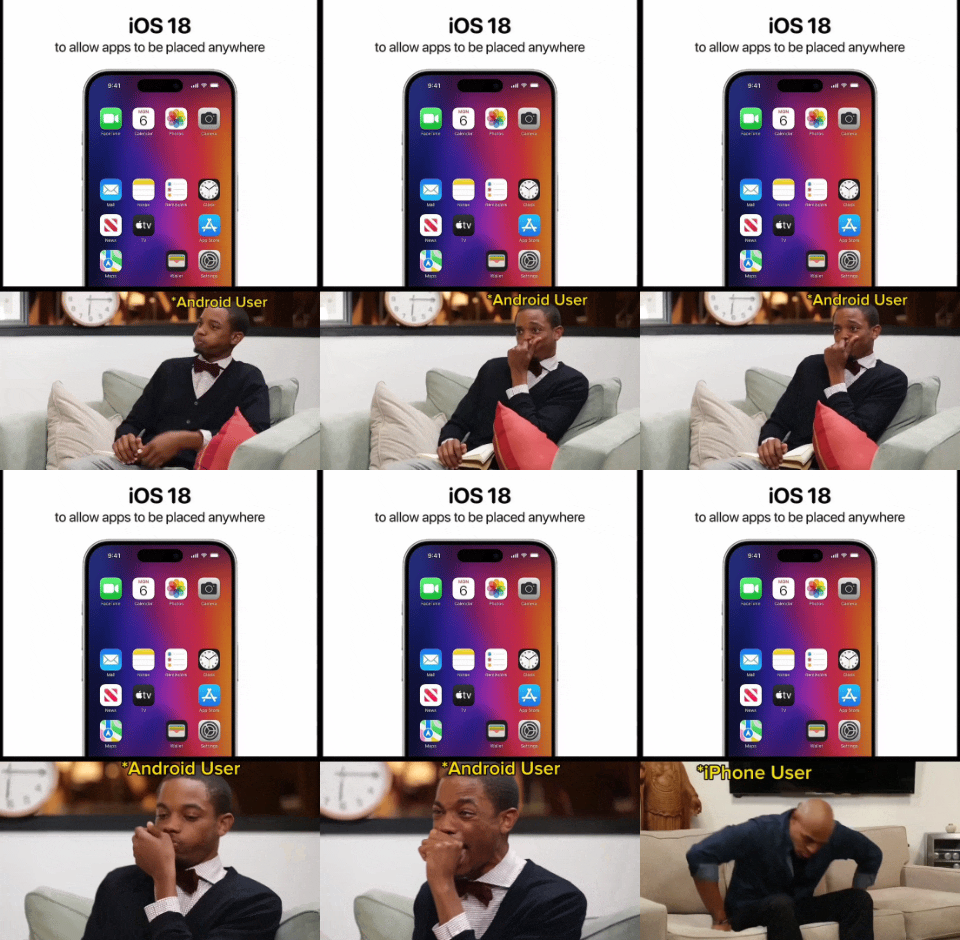
As a former Android user, my iPhone home screen looks wildly different from people who’ve had iPhones for many years. I have very few icons on my home screen, I have widgets taking up most of the top of the screen to push the icons I do have down near my fingers (because Springboard is still stupid as of iOS 17, as this gif is pointing out), I have more widgets to the left (“Today View,” Apple calls this, it’s basically just a scrolling widget section), and then the app drawer equivalent to the right (which Apple calls “App Library”). It’s clean and beautiful and reminiscent of my lovely Nova launcher setup I had on my beloved OnePlus 7T Pro (may it rest in peace).
Whereas most longtime iPhone users just have page after page after page of apps and folders. Every app they own is on there somewhere. Which is ridiculous since on iOS you can just swipe down, type the first few letters of the app, and there it is.
Before the app library existed you just had to have all the apps on a page and could not hide them. I ended up having like 20 page of apps. I eventually cleaned things up and have a page with apps I use, another page of widgets I use, and that's it. But it took me years before I thought to do that.
It’s funny, I’ve had an Android, a Nokia Windows Phone, and an iPhone, and Windows Phone was the only OS in which I didn’t open every single app through search. The utter lack of an app ecosystem definitely played a part, but I honestly don’t think either of the other two handle home screens/“app drawers” very well. Every modern social media platform/messenger/etc. is built around vertical continuous scrolling because it’s easier. Why is horizontal, paginated scrolling the default for home screens?
That's a good point. Now that you mention it, I would much rather my Home Screen scroll down and I can add as many apps and widgets as I want.
The current iPhone page feels a bit claustrophobic now. Thanks.