this post was submitted on 26 Mar 2024
192 points (88.1% liked)
MapPorn
3223 readers
1 users here now
Discover Cartographic Marvels and Navigate New Worlds!
Rules
- Be respectful and inclusive.
- No harassment, hate speech, or trolling.
- Engage in constructive discussions.
- Share relevant content.
- Follow guidelines and moderators' instructions.
- Use appropriate language and tone.
- Report violations.
- Foster a continuous learning environment.
founded 2 years ago
MODERATORS
you are viewing a single comment's thread
view the rest of the comments
view the rest of the comments

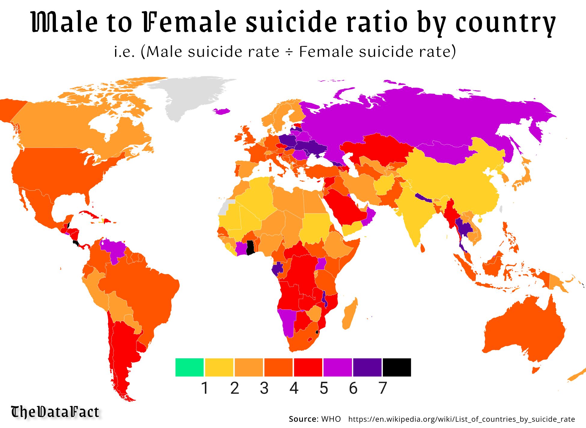
If it is green then they have the same average right? 1:1. But in this graph it would be difficult to show when more women committed suicide, which might nowhere be the case.
Or you'd get 0.5 with a color match, for example.
Women literally never commit suicide at the same rate or less, that's kind of the point.
Ok, but if you (me) didn't know that coming into this, you'd be confused why it only scaled one way. I would've figured there's at least some parts of the world where women had higher rates than men.