this post was submitted on 27 Jul 2023
20 points (100.0% liked)
Typography & fonts
90 readers
1 users here now
A community to discuss and share information about typography and fonts
Sibling community:
Rules of conduct:
The usual ones on Lemmy and Mastodon. In short: be kind or at least respectful, no offensive language, no harassment, no spam.
(Icon: detail from the title of Bringhurst's Elements of Typographic Style. Banner: details from pages 6 and 12, ibid.)
founded 2 years ago
MODERATORS
you are viewing a single comment's thread
view the rest of the comments
view the rest of the comments

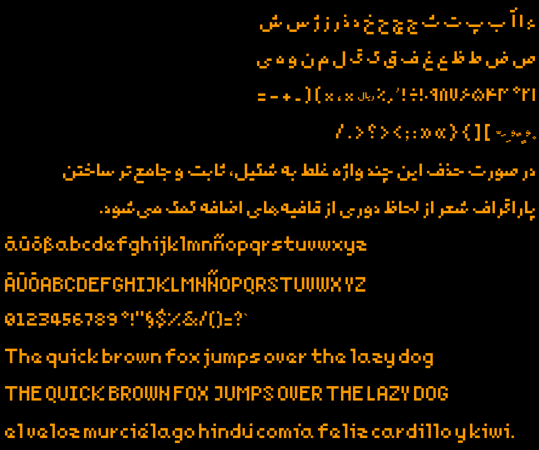
I took me a while, but finally I made those changes. Now there is capitcal ß. I might even separate those dots in a next version, already experimented with that.